


Day 2 of Dashboard Week is underway! During this training week, we’re given a prompt each morning and challenged t0 complete a dashboard by 3 pm.
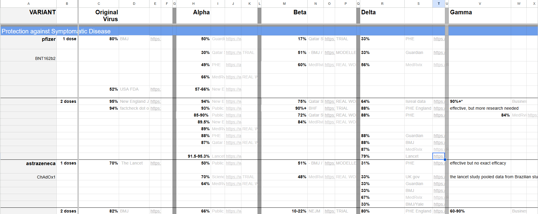
Today's topic was: COVID-19 vaccine effectiveness. Our main focus was on data cleaning. Here is a preview of the data we were given:
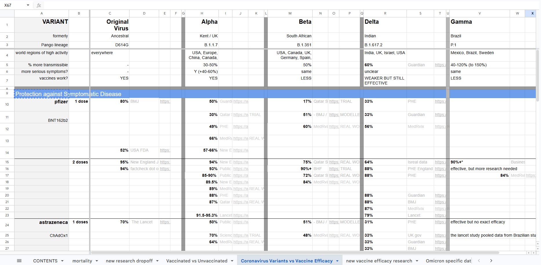
As you can see, it's rather messy! It was created for readability in Excel, not for Tableau.
Our challenge was to use Tableau Prep or Alteryx to shape/clean/prepare the data in a way that would allow us to build a simple dashboard in Tableau. I opted for Tableau Prep.
Here are the steps I took:
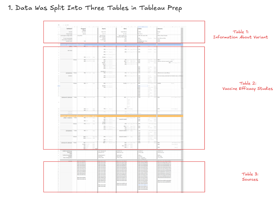
First, I split the one giant table into three smaller tables
One table contained information about the variant (the top rows), one contained information about vaccine efficacy against the variants (the middle rows), and one contained information about the sources (the bottom rows). I skipped the bottom-middle section due to time constraints, but a fourth table could absolutely be created with that information.
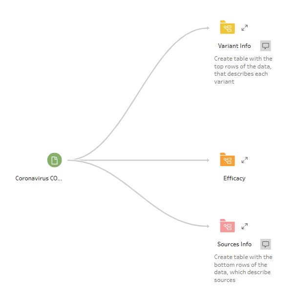
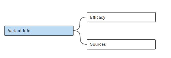
This gave me three "branches" in Tableau Prep:
Next, I cleaned the first table with information about the variant
This was relatively simple and entailed
- Filtering
- Only keeping top rows
- Basic Cleaning
- Renaming columns
- Replacing dashes with nulls
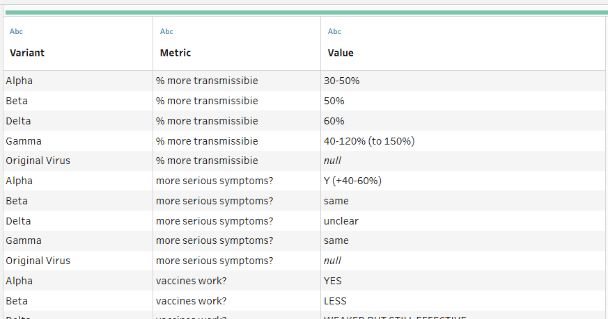
- Pivoting the data, such that we have one column for variant name, one for the metric, and one for the value
Here is what the final output looked like:
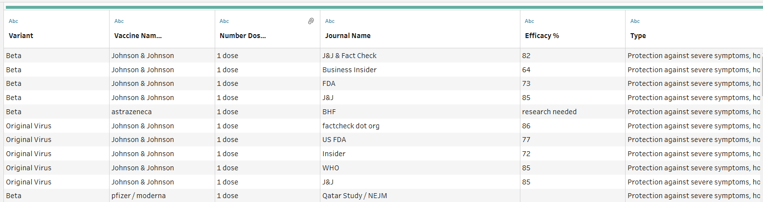
Third, I cleaned the table with information about the vaccine efficacy
As a reminder, here is an excerpted section on vaccine efficacy:
And another:
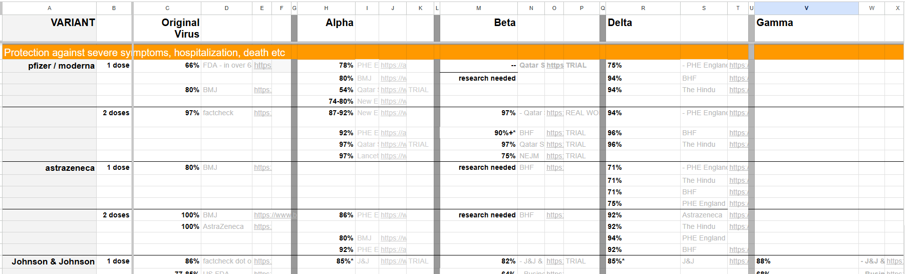
My goal was the get to a stage where there was one row for every variant, vaccine name, dosage number, journal name, and type of COVID-19 protection offered. From that point, we could have additional information brought in about the journal source, efficacy %, links, and other details.
The cleaning entailed a whole long list of steps.
I won't include all of them here, but my general approach was to create separate tables for the blue section (protection against symptomatic disease) and the orange section (protection against severe symptoms).
Then I created separate tables for each of these variants: (1) original virus, (2) alpha, (3) beta, (4) delta, and (5) gamma, as well as their associated columns describing the source/journal name, journal link, efficacy %, details, vaccine, and number of dosages.
This gave me 10 different tables, which I then unioned together.
Is unioning the best way to approach this? Not necessarily. Pivoting would likely achieve the same result in fewer steps. However, I approached the problem this way because the multi-field/dimension pivoting was giving me trouble in Tableau Prep.
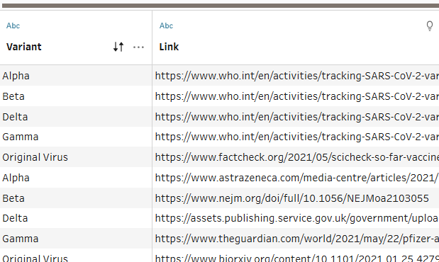
Fourth, I cleaned the table with information about the sources
My last step was to clean the source table. This was straightforward. All I had to do was:
- Keep just the bottommost rows
- Remove unneeded columns
- Pivoted the data, so that I had one row for every variant and link combination
Relationship the tables together in Tableau Desktop
At this point I had my three separate tables, which I could then create a relationship between in Tableau Desktop using the variant name:
Build Dashboard in Tableau
Since all the tables were connected on the variant name, I wanted to use that as a filter for my charts. This way, a user could select a particular variant they're interested in (say, the Alpha Variant) and view information about the variant and vaccine effectiveness.
Here is a screenshot of my final dashboard in Tableau!
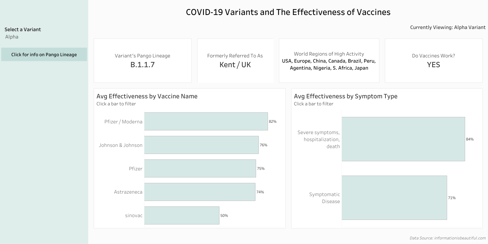
That's a wrap on Day 2!