


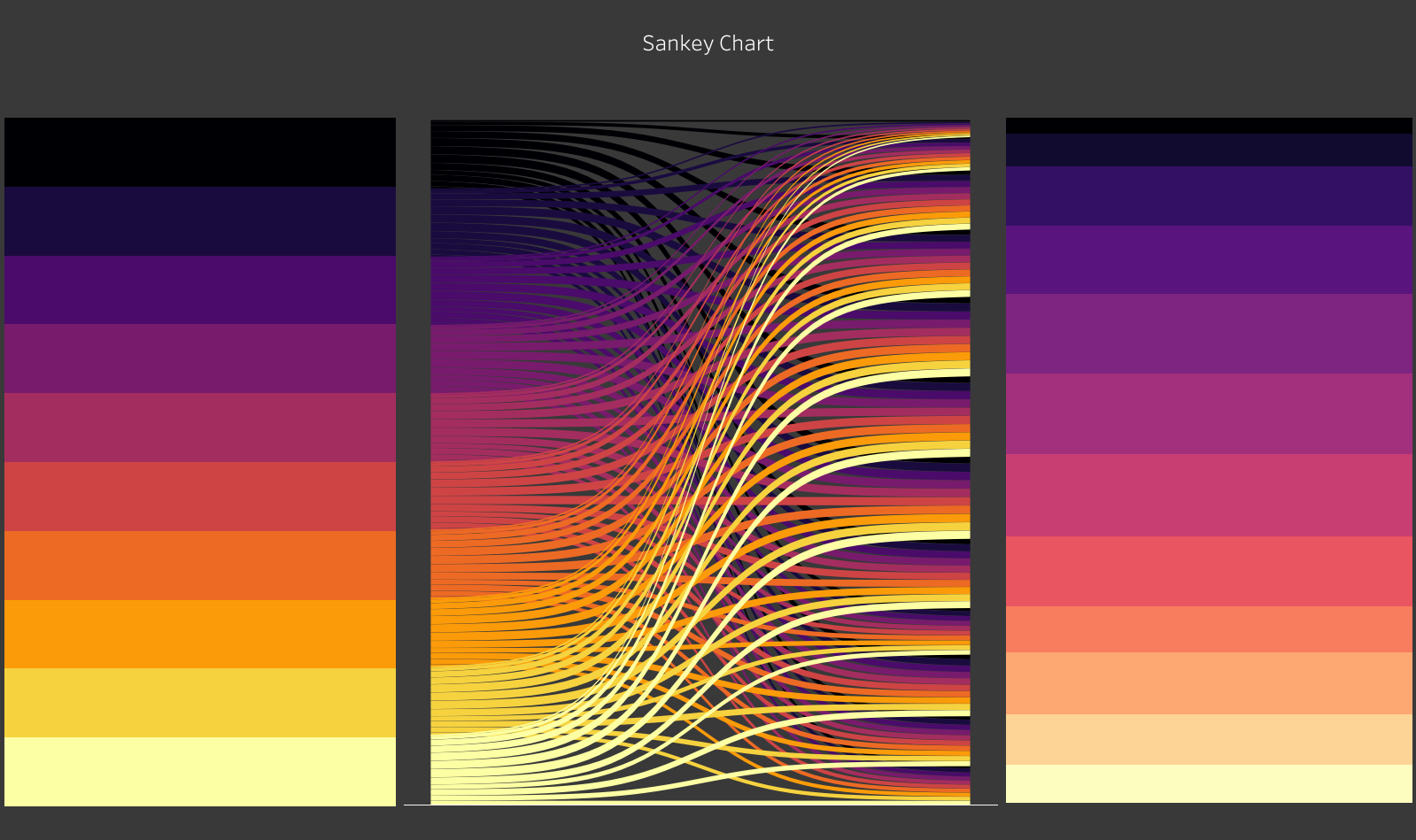
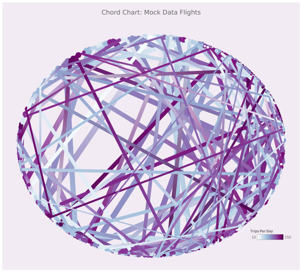
Pie charts, donut charts, and Sankey diagrams are typically used to convey proportions and flows. They are considered engaging because they often look cool and aesthetically pleasing. If you doubt that these visualizations can be beautiful, take a look at the two following visualizations made by Tara Robinson (DS35).
Example of a Sankey Diagram:
Example of a chord graph:
Some graphs may even be categorized as art pieces, and it is hence unsurprising that they are used in many Data Visualisations.
Admire this recreation of 'the girl with a pearl earring' by Johannes Vermeer made with 84000 pie charts:

(Created by Ken Flerlage)
While pie charts can be visually appealing and useful to show proportions, they are not always the best choice for visualizing data because they can be difficult to interpret accurately. The most important aspect of a visualization is to convey information effectively and pie charts are simply not the best tool to do so. Here is why:
- Difficulty to Compare: Pie charts are best suited for displaying a small number of categories. When you have too many categories, the chart can become cluttered and difficult to read. It is hence difficult to compare the sizes of different segments and this is especially true when the segments are similar in size. It is often easier to compare the heights of bars in a bar chart or the lengths of lines in a line chart.
- Misleading Perspective: The human eye has difficulty accurately judging the size of angles, which is how pie charts represent proportions. Depending on the placement of the slices, it can be easy to misinterpret the proportions of the data. For example, if a slice is positioned at the top of the chart, it may appear larger than it is.
- Not Showing Changes Over Time: Pie charts are not ideal for showing changes over time. Line charts or area charts are better for this purpose. With a pie chart, you can only show the data for a single point in time, making it difficult to track changes over time.
- Inaccessibility: Pie charts can be difficult to interpret for people with visual impairments or color blindness. It's important to ensure that data visualizations are accessible to all users. For example, simplifying or adding labels to the chart can help people with visual impairments understand the data.
In summary, pie charts can be appealing tools for visualizing data, but they are rarely the best choice when it comes to conveying information effectively. When selecting a type of chart to use, consider the number of categories you need to display, the ability to compare data accurately, the potential for misleading perspectives, the need to show changes over time, and the accessibility of the chart. By carefully considering these factors, you can choose the best type of chart for your data and create a clear and informative visualization.
Spoiler: When in doubt, make a bar chart!