For a complete video tutorial, I highly recommend Will Sutton's free tutorial on building radial heatmaps in Tableau.
Introduction
In this blog, we will explore the process of creating a radial heatmap in Tableau. While radial heat maps may not be considered best practice in data visualization, they can be visually appealing, draw attention to your work and make your dashboard stand out. Before detailing how to build a radial heat map, I will shortly address some challenges associated with this type of chart, and the use cases that I found most relevant.
Issues with radial heatmaps
Distorted perception: Radial heatmaps use circular or radial encoding to represent data values. While this format can be visually appealing, it can introduce distortions in perception. Humans perceive angles and lengths inaccurately, leading to potential misinterpretation of the data encoded in the visualization.
Limited scalability: Radial heatmaps may not scale well with larger datasets or complex data patterns. As the number of data points increases, arranging them in a radial layout can become visually cluttered and difficult to interpret. It may be challenging to compare values across different sectors or radial axes.
Encoding accuracy: The encoding of data values in a radial heatmap relies on variations in color or intensity. However, accurately distinguishing small differences in hue or intensity can be challenging for viewers, leading to potential misinterpretation or misjudgment of data values. Additionally, color-impaired people might have a particularly hard time interpreting your radial heatmap.
The Power of Radial Heat Maps
Now that the warnings on radial heatmaps have been made, let's jump into the reasons why you would want to build a radial heatmap in the first place.
Radial heatmaps are particularly useful for visualizing time data because they leverage the visual metaphor of a circle. Time being seasonal, the idea of a circle or a loop is intuitive to people, and radial heatmaps capture that idea very well. Common use cases include displaying 12 months in a year, 24 hours in a day, or 52 weeks in a year. By adjusting parameters, such as the number of rings and segments, you can customize the chart to your needs and make a real impact on your viewers.
Step-by-step guide
1. Generating a Radio Heat Map Template
The first step in building a radial heatmap in Tableau is to generate a template. To do so, simply go to Will Sutton's app that he built using R-shinny and play around with the parameters before downloading your template in CSV format. The crucial part of this step is to understand how many rings and segments you will need.
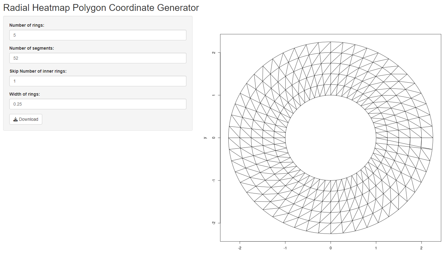
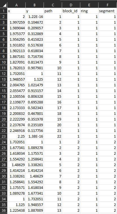
The number of rings will typically depend on the number of years you have in your datasets and the number of segments will depend on how you are dividing the year in your dataset. For instance, if you want to visualize 5 years of data aggregated by week, you will need 5 rings and 52 segments. You could also choose to visualise 4 weeks of data and aggregate by days of the week. In this case, you would need 4 rings and 7 segments. Once you are happy with your template, download the corresponding CSV file containing the coordinates required for Tableau.
2. Incorporating Data into your radial Heatmap template
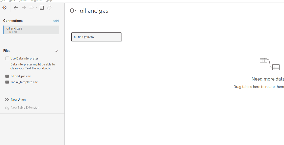
Obtain a dataset compatible with your desired visualization. As mentioned earlier, your dataset should ideally contain a date field and a field exhibiting seasonal variability. The next crucial step is to prepare your dataset, ensuring it includes the necessary columns (a date field containing at least two different levels such as year and month) for the radio heatmap. Once your dataset is prepared, you will need to join it to the template data you generated earlier. To do so, start by going to the data source page of Tableau desktop and adding your template data to Tableau. Drag your template dataset onto the data canvas in order to build a relationship.
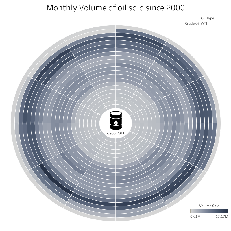
For this example, I wanted to explore the volumes of oil sold since the year 2000. I downloaded a dataset on Kaggle and made sure it contained a date field. I then created a radial heatmap template with 22 rings and 12 segments (meaning I would have 22 years of data aggregated at the month level) and added both datasets to Tableau.
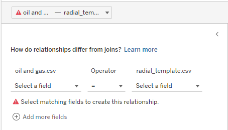
To finish building your relationship, Tableau will now urge you to specify the fields on which you want to build your relationships. Because I am joining the two datasets over months and years, I will need to build two relationships. To match the format of the template fill, you will need to convert your months and years to sequential integers (1,2,3,4...). For instance, the month of January will need to be set to 1 and the month of December will need to be sent to 12. Additionally, the first year in your dataset will need to be set to 1 and subsequent years will need to be set to 2, 3, 4, etc.
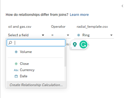
To join on years, select the 'ring' field in the template and create a 'relationship calculation'. You will need to use the datepart function in this formula. For more information, consider reading this intro to Tableau date functions written by Diaraye Barry.
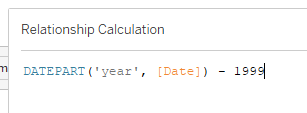
Because my start year is 2000, I have to subtract 1999 from each of my years to obtain the sequential integers (1,2,3,4...).
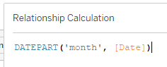
To join on months, click on 'add more fields', select the 'segment' field in the template data, and create another relationship calculation. Then, use the datepart formula to obtain the number of each month.
Your two datasets are now joined and the fun part can begin!
3. Building the chart in Tableau
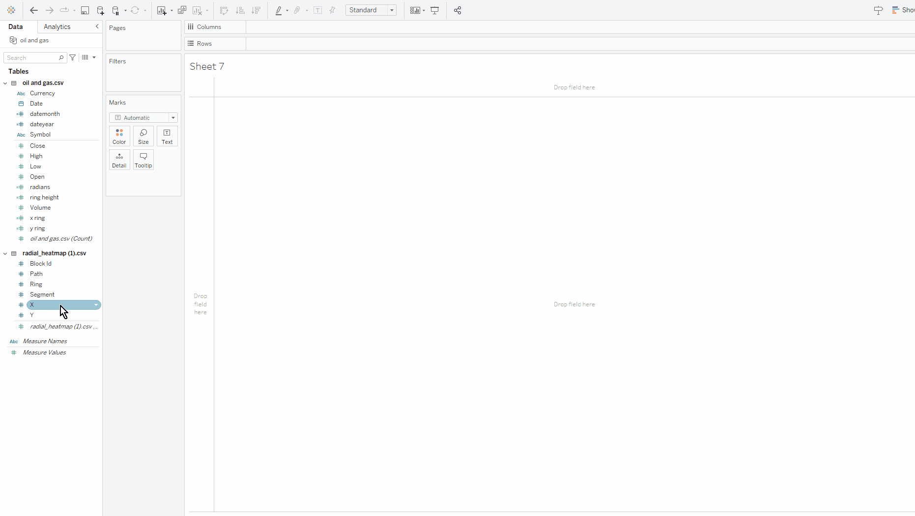
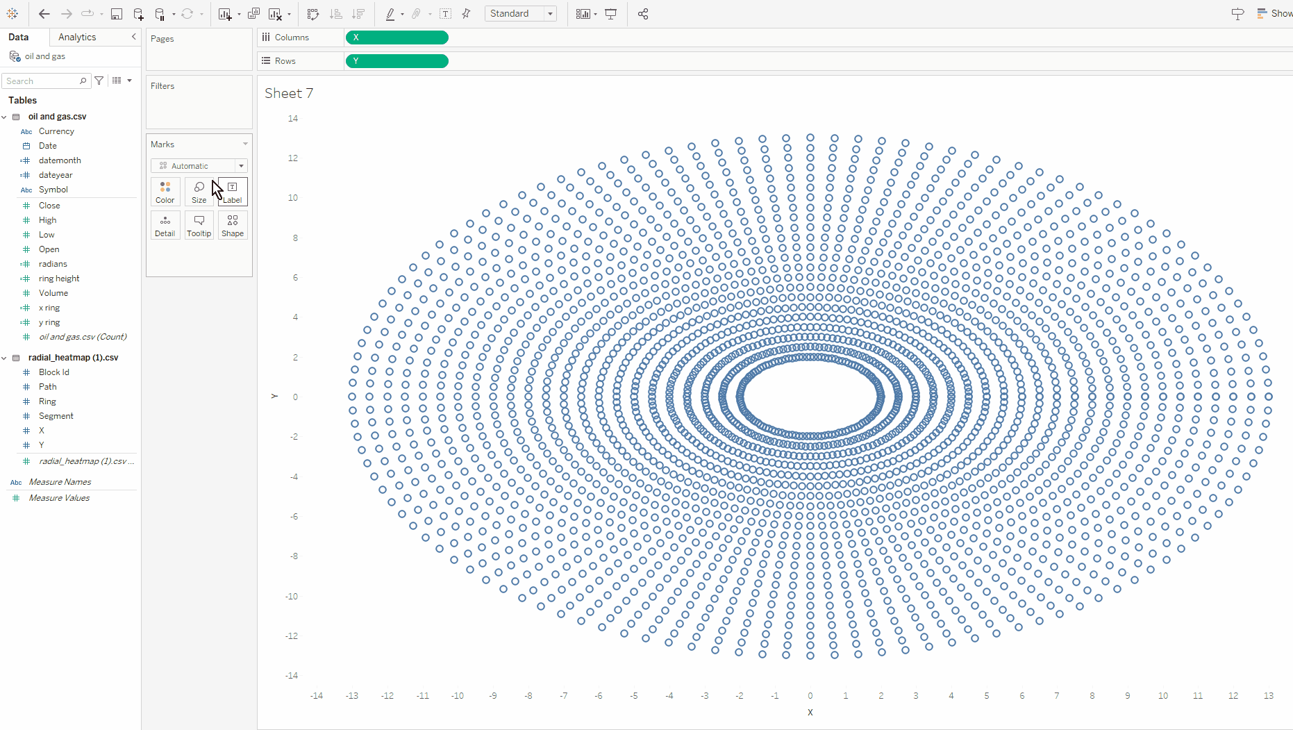
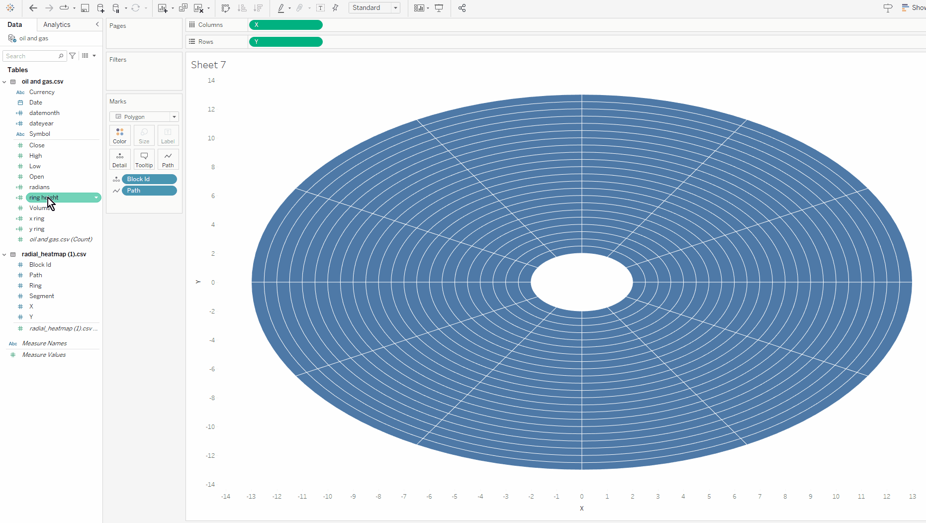
Start by dragging your X field to the column and your Y field to the rows. Make sure that your fields are continuous dimensions!
You should now see your radial chart start to appear. The next step is to change the mark type to polygon. Do not worry if you see your chart turn into an oval bar code. Trust the process!
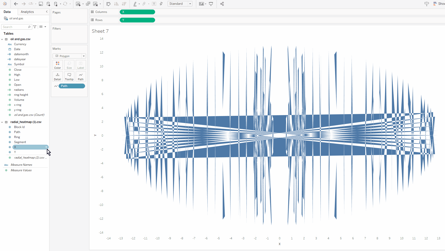
You will now be able to drag and drop the Path field into the Path mark.
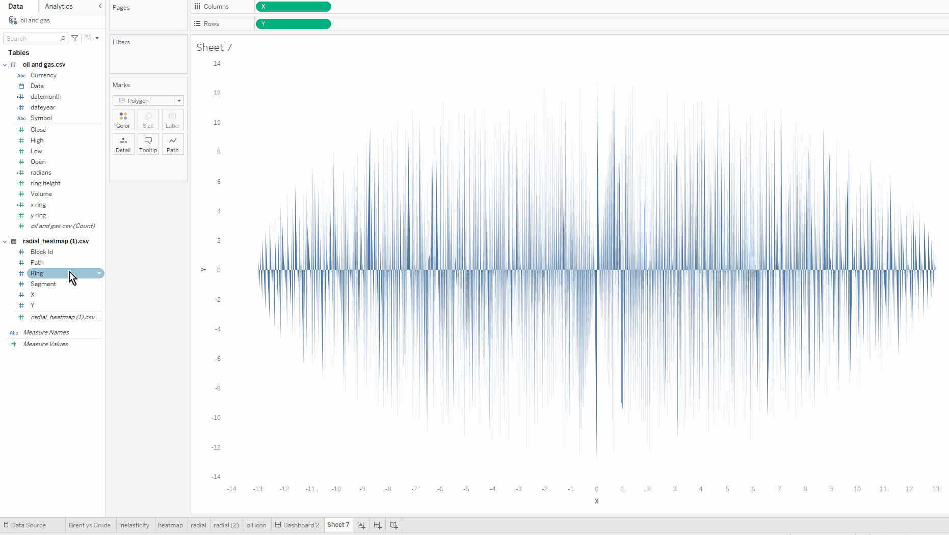
If your chart is looking like the draft of a Picasso painting, once again, this is part of the process!
The next step is to drag block id on details and add white borders to your graph. You should now see your radial heatmap appear before your eyes.
The last thing you need to do, is add your measure field on to colours and reshape your graph to a circular shape. Here I chose Volume of oil sold as my measure field as I wanted to understand how the volume of oil sold evolved across time.
With a little more work formatting your chart and playing around with colours, this is what I ended up with:

Conclusion
In conclusion, creating radial heatmaps in Tableau can be accomplished efficiently by following an easy process. By using Will's template generator, you can easily visualise your data on a radial heatmap and incorporate that chart into any dashboard you like. I hope this blog was useful! Do not hesitate to ask any questions you have or send me the radial heatmaps you created.