Aggregating enables us to reduce the granularity of data to answer many different questions. In this blog post, we will take a look at simple aggregation functions available on Tableau.
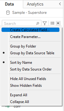
To use aggregate functions in tableau, start by creating a calculated field by selecting "create calculated field" in the data drop-down menu.
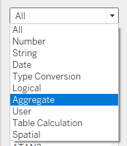
In the search menu of the calculated field, select "aggregate".
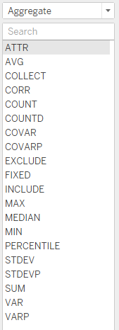
A new menu should now appear with 20 different aggregate functions to choose from.
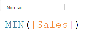
In this blog, we will try to get a better understanding of data distribution by using some of the available aggregate functions. You can start the investigation of your data by finding the maximum and minimum of your data with an aggregate function. Here the function MIN() reads through the [Sales] field and outputs the lowest value it finds into a new variable called 'Minimum'.
Calculating averages is a good example of data aggregation that we can use to get a better understanding of our data. The AVG function enables us to calculate the mean of a field easily as so:
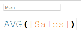
In this simple example, Tableau will sum up the total value of sales and divide it by the total number of sales before storing it in a new variable called 'Mean'.
The median is another type of average you can obtain with aggregate functions.
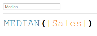
Here, tableau finds the middle value in a dataset when the values are arranged in order. The median is particularly helpful as it is less sensitive to outliers and extreme values. Indeed, it is not affected by the exact values of outliers, but rather by their position relative to the other values in the dataset. This makes it a useful measure of central tendency for skewed data or datasets with extreme values.
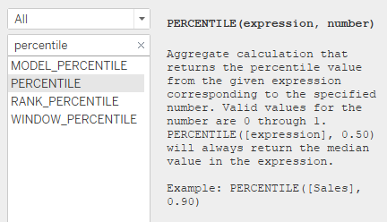
Now on to a slightly more complex function with two parameters. The percentile function is another aggregate function that can be used to calculate the value below which a certain percentage of the data falls. This function takes in the field you want to analyze as well as a decimal number between 0 and 1 (representing the percentile value you have chosen). In this example, we choose to find the value below which 90% of the data falls.

Tip: Just like any other functions in tableau, you can find a description of the percentile function and an example of how to use it on the left of the calculated field.
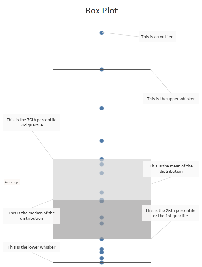
Bonus: The aggregate functions we just went through can also help us understand the content of a box plot! Box plots are really useful to visualize the distribution of a field. Take a look at the diagram below or click on the link to explore it on my tableau public account.
