


In this blog post, I will guide you on how to add country flags to a bar chart in Tableau. Bar charts are a powerful visualization tool, and by adding country flags, we can enhance the visual appeal of our charts while also providing important context to the data. So, let's get started!
Step 1: Create your bar chart
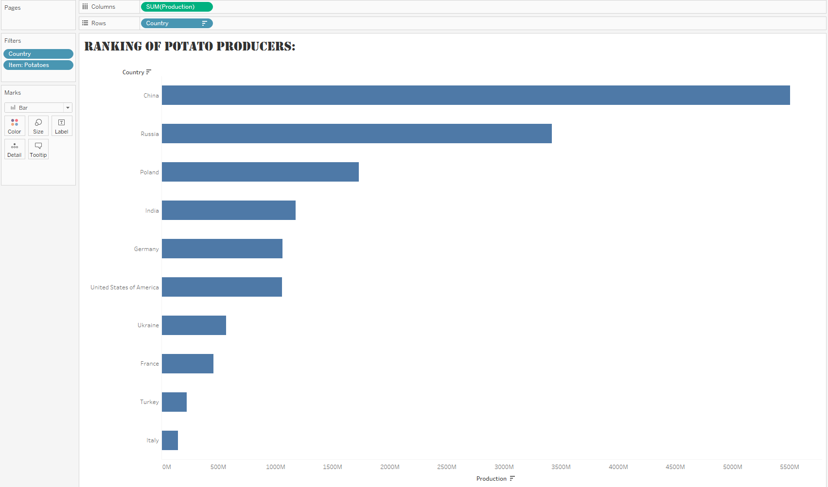
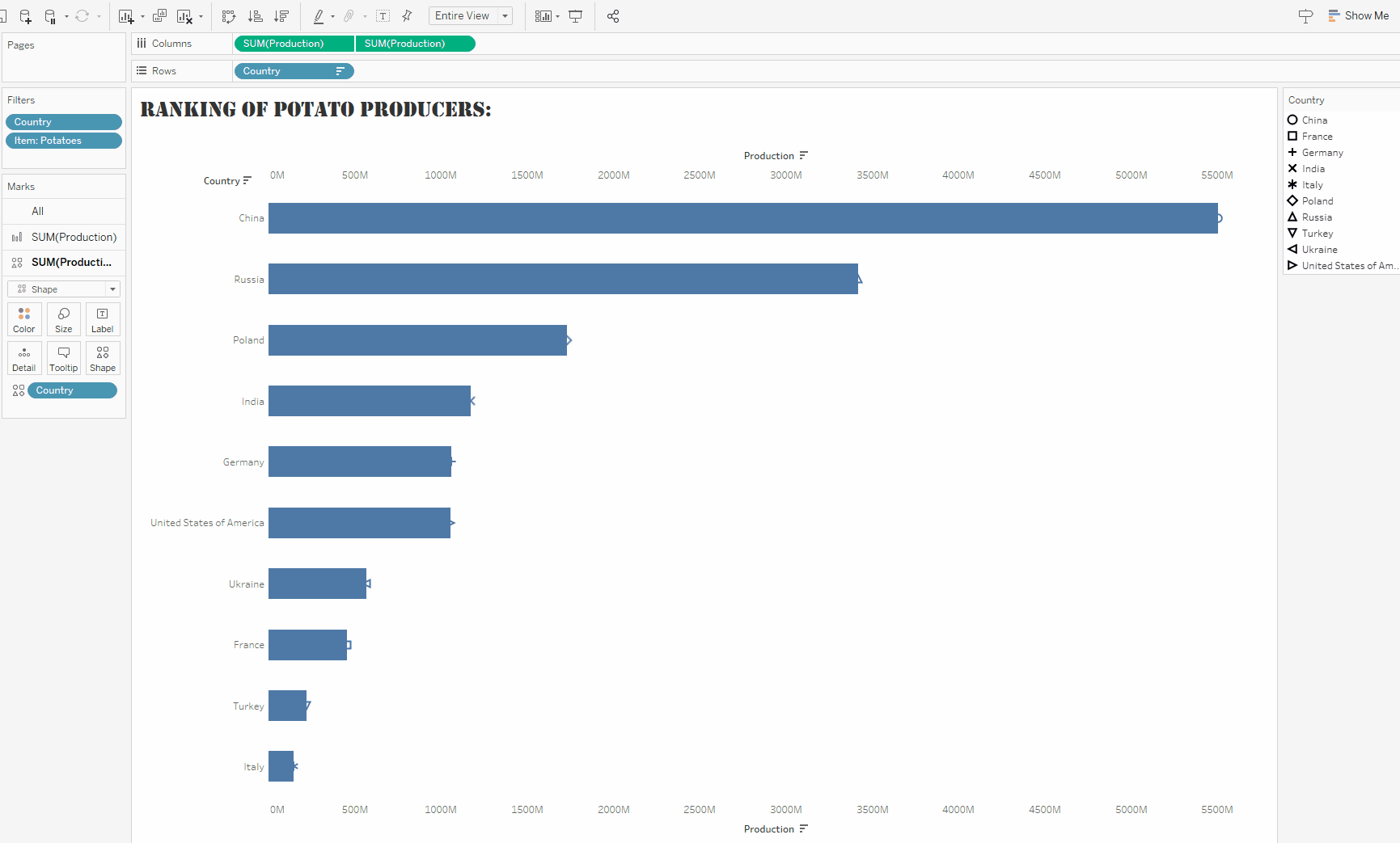
Here, I am using a dataset describing the potato production by country and I want to identify the biggest potato producers. To do so, I built a bar chart by dragging the sum of potato production field on columns and the country field on rows.
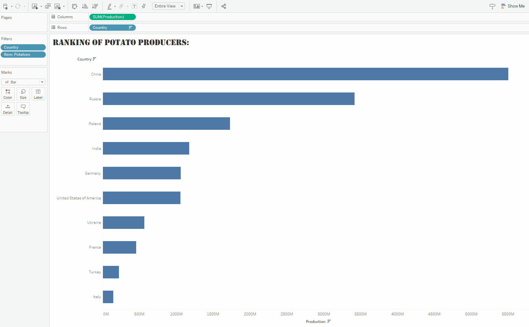
Step 2: Create a double axis
Start by duplicating your chart by pressing on your Ctrl key and dragging your sum of potato production from your column to your column.
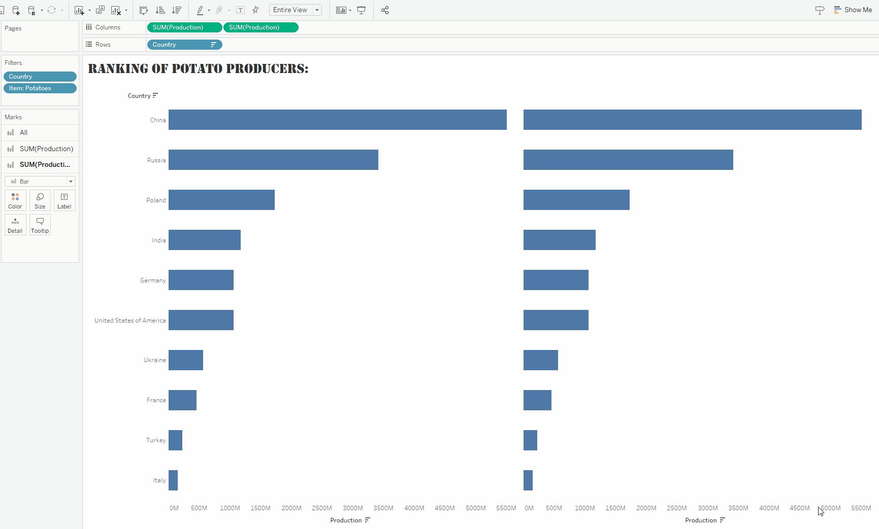
Change the mark type of your second chart to Shape and drag country from rows to Shape (by pressing Ctrl)
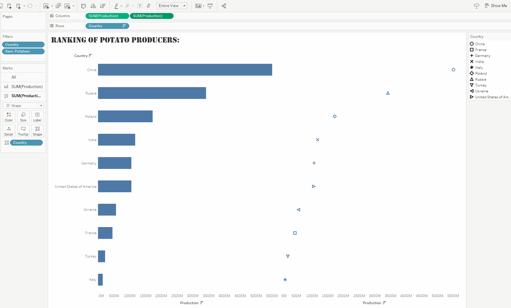
Create a Dual Axis by left clicking on one of the aggregated fields in the columns and selecting "Dual Axis". Then, right click on the axis and press "Synchronise Axis".
To do so, you will need to download the flag pictures from the internet and put them in the shape folder of your Tableau Repository.
You can find and download the png of these country flags on the following website:

Once you downloaded these country flags and placed them in the right folder on your computer, simply change the default shapes of your legends to their corresponding country flags.
Lastly, adjust the size of your flags to fit the bars.

Et voilà!