For this blog I will be discussing my personal project which was using data for the women's football Euro's 2022. This blog will be discussing the process in which I took as well as considering some of the problems I found on my journey when doing this project.
Why Women's Football?
Women's football has always been overlooked for many decades compared to men's. For England in 2022 history was made in the women's Euro's as they ended up winning it. When I was at University I actually joined the women's football team and this is where I started to appreciate the sport more and watch more games. The other thing I noticed was on Tableau Public, most football visualization's were looking at men's games, though there were some for women's football there was very little which covered the Euros.
Process
So originally I knew I had to web scrap to get this data as there is currently not a dataset on this. This was the most challenging part of this project because though I had done a small amount of web scrapping before this but these websites I were unable to put in json format so I experienced different problems and tried multiple approaches for this. Such as using this tool which involved using Xpath Language ( which I had never worked with before).
After struggling for a while web-scrapping trying different things I reached out on convo and someone was able to help me find the data I wanted and luckily for myself had already made some Alteryx workflows which allowed me to scrape the data- I had to change some of the filters so that I it would be for the women's football and especially for the Euros. The data source was GitHub - open data These are what some of the workflows looked liked:
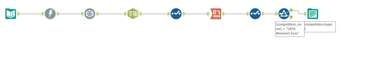
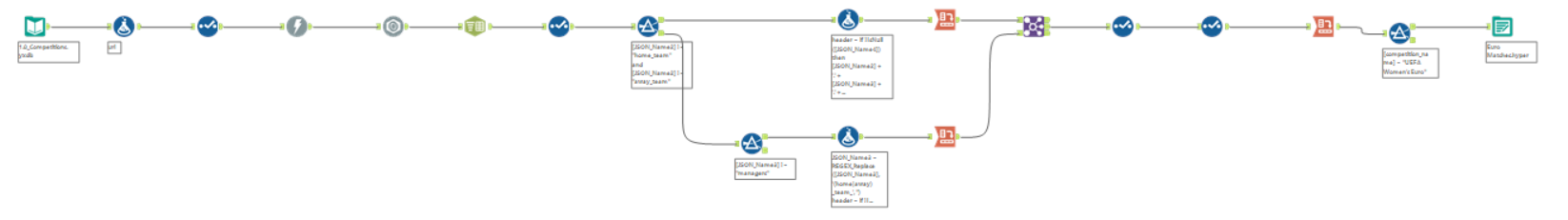
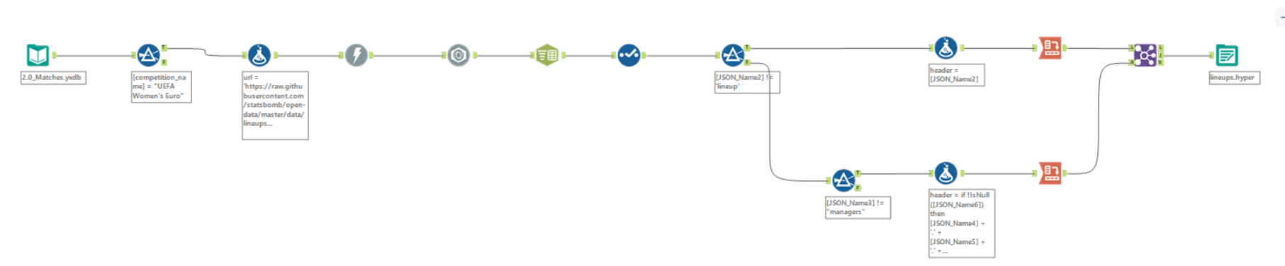
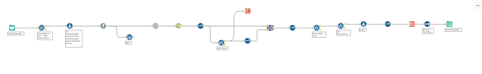
I mostly just used events as it covered majority of the information from all of these i did use relationships to matches.
For this it would have been better for me to create a macro for all the different topics in events however because I only wanted to focus on a couple I changed the filter to the topic of interest.
Next was to start making dashboards. First before I got to carried away I made a plan for what I wanted. This was my initial sketch ( redone in excalidraw as done it in a notebook originally).
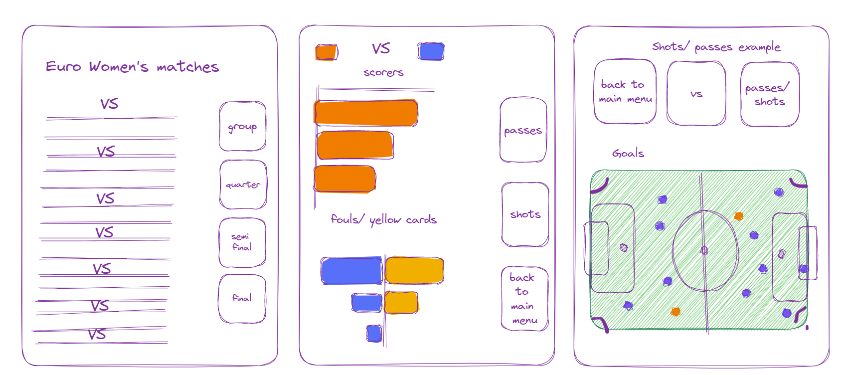
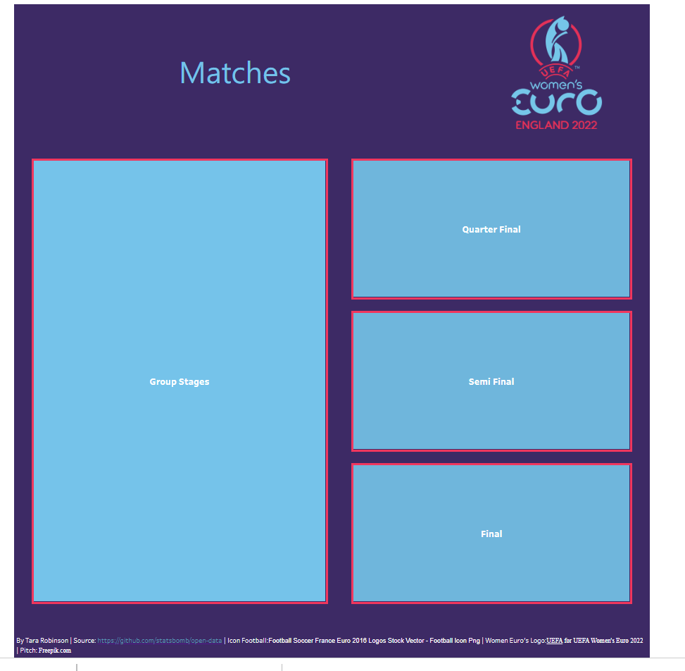
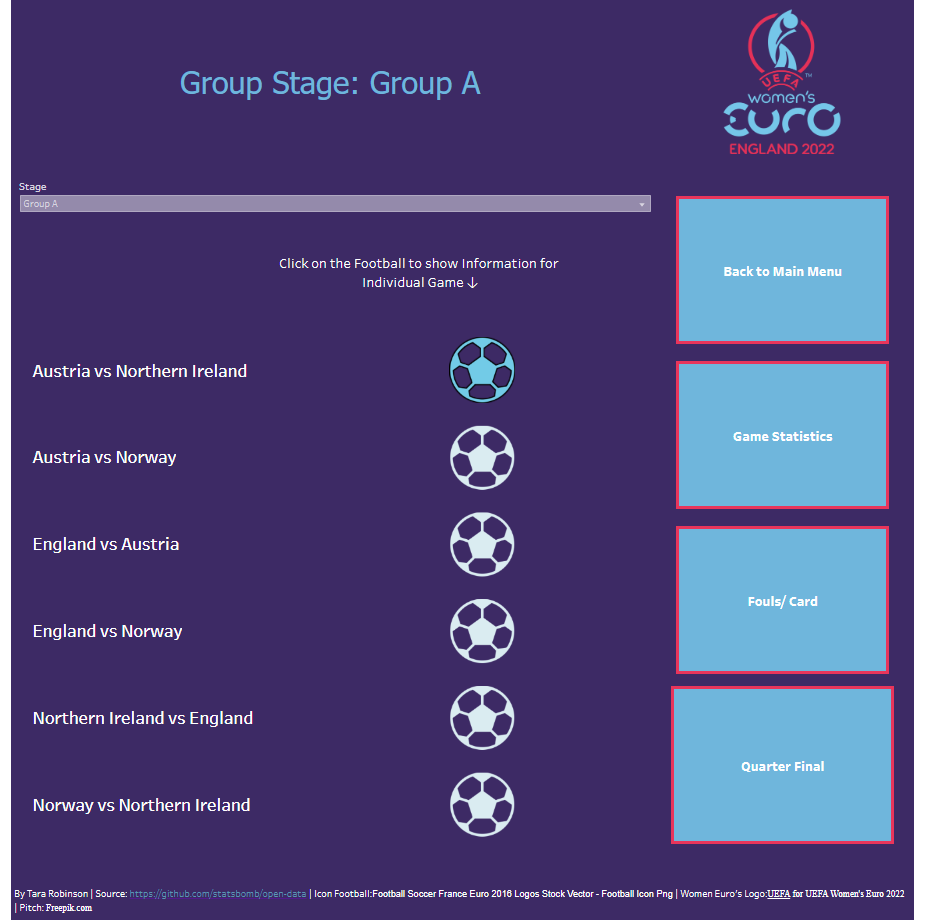
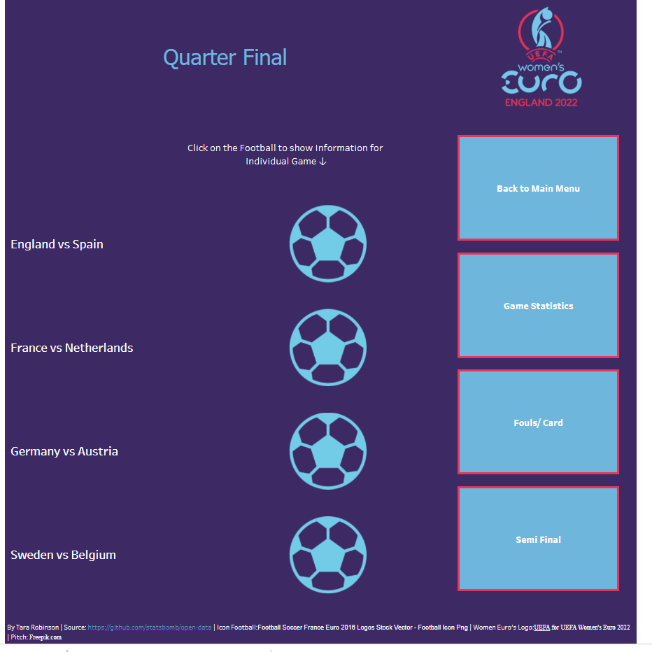
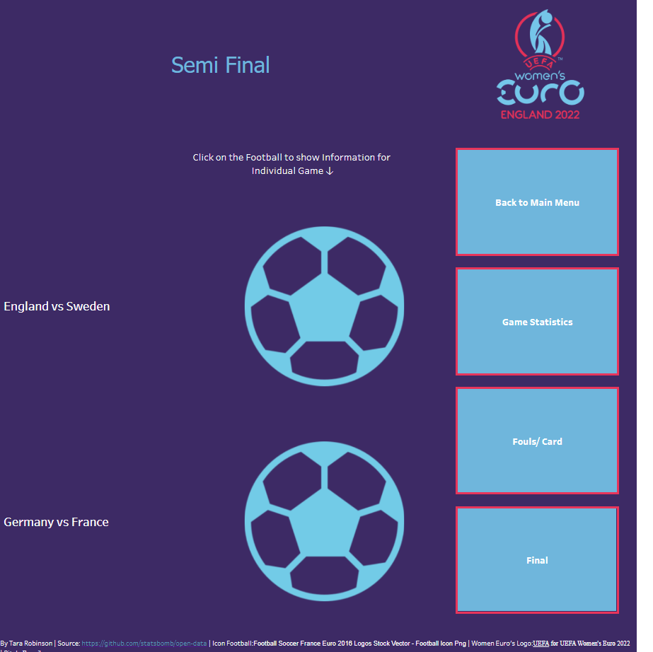
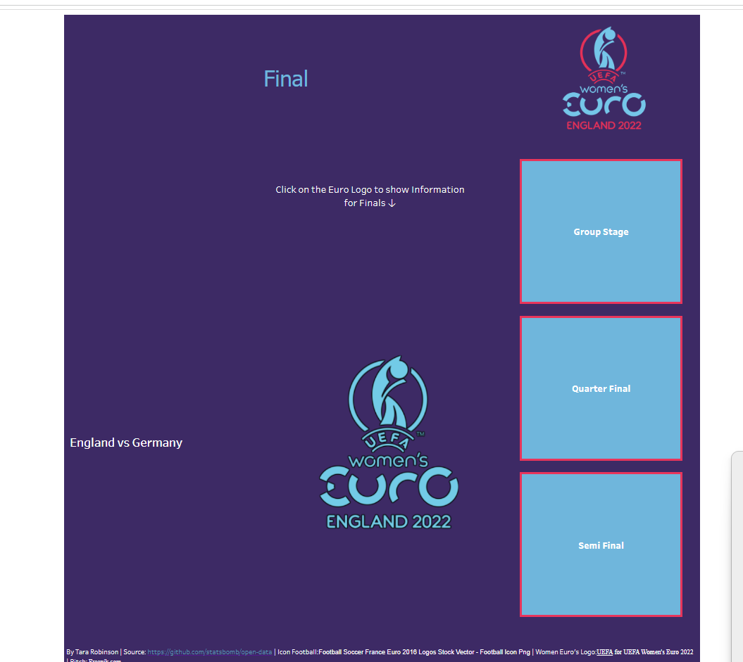
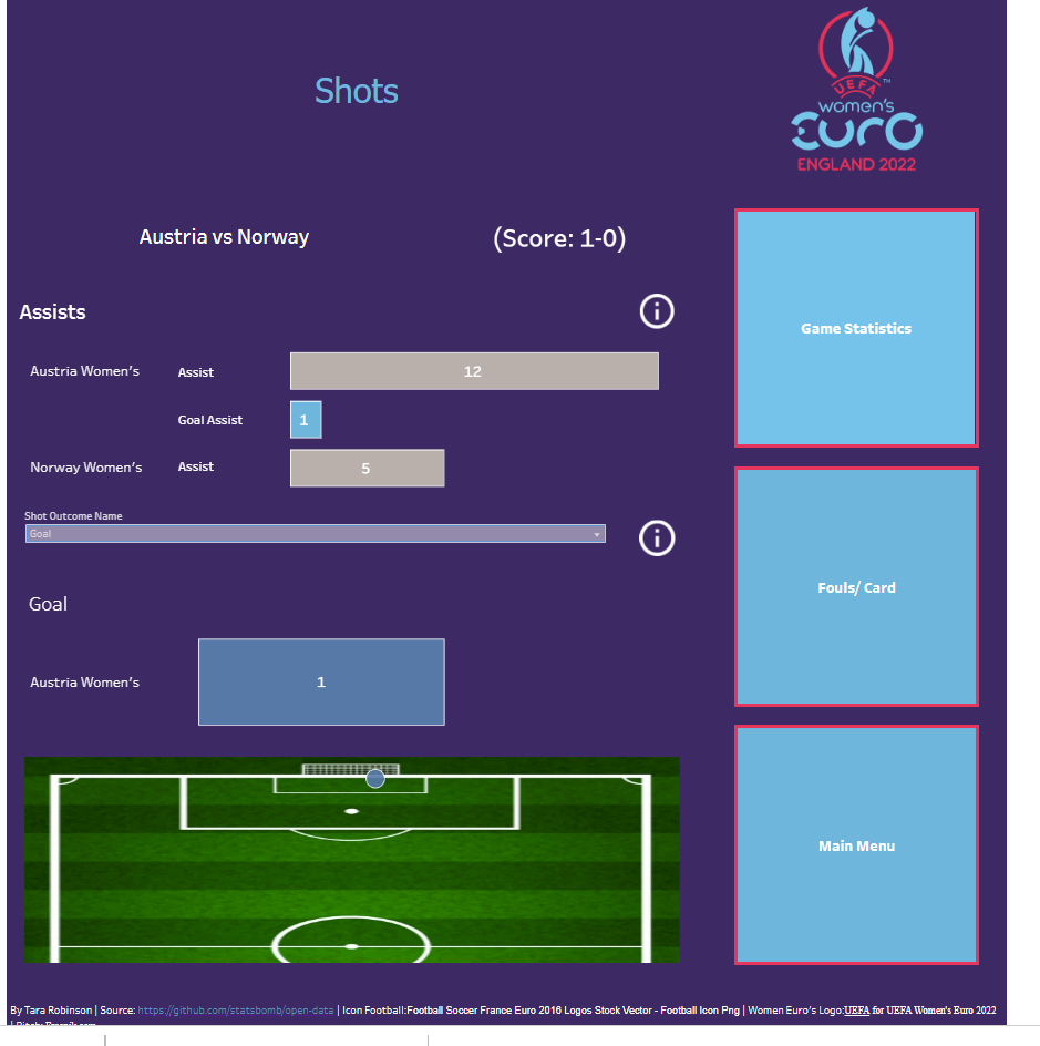
Though this was my initial idea I did not stick to it fully but used some of the ideas. This was because I could not show passes as I mapped a background image but without using makelines I could not show route of pass ( as currently you can't map coordinates properly on an image). This was the final product:
This gif below just shows some of the interactions:
Overall I really enjoyed doing this project as this is data that I am interested in and I believe it shows a clear way to visualize this data it a interactive way which keeps the audience interested.