Its the final count down as they would say. The last blog for dashboard week.
Survivor! the tv show was todays challenge. And this was the data set used for the final interviews in New York recently. The applicants have about 2 weeks; we had 6 hours.
The data is based on the hit TV show Survivor and is provided in two formats.
1. castaway_season_combined.xlsx - This file contains two sheets, Data and Data Dictionary. The Data table is a joined version of three tables in the survivor dataset: castaway, castaway_detail, and season_summary. The Data sheet contains the joined tables and the Data Dictionary sheet provides a description of each field as well as its source table. The Data Dictionary sheet also contains an important note regarding the granularity of the data.
This is the only data provided that we have documented. It is provided to be the base data from which you can build any number of visualizations and has plenty of room for interesting analysis. You will not be docked for using only this data in your final visualization.
2. Survivor-full-data.xlsx - This is an extra excel file that contains a sheet for every table of the survivor dataset. It is provided for those who are interested in the full data. We do not provide any documentation on the fields in these tables or the join keys. This information can be found in the survivor Github repo. They are welcome to use data from these tables in your final visualization but it is not required.
I really enjoyed this challenge. Today I set my own challenge of showing more complexed graph then your standard bar chart. I realized their was a problem with my relationships close to presenting so this is an issue I will have to resolve after.
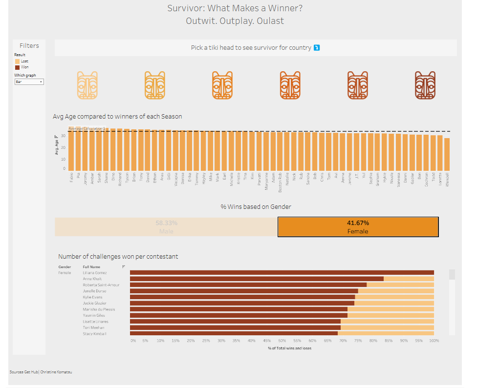
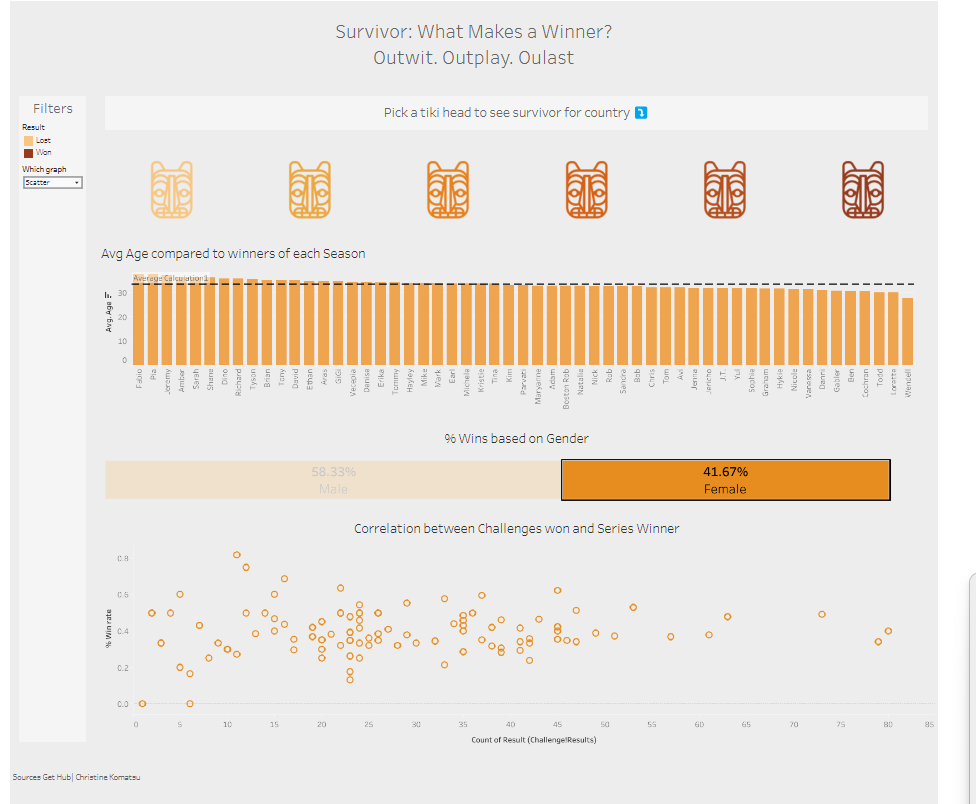
Here was the final dashboard:
Todays struggles:
- Colour palette with so many different graphs it was hard to make a decision whether to have it uniform and multiple legends or have colour variations. I think this could have gone a lot better.
- Time dedication to actually making the dashboard.
If I had more time I would dedicate more time to practicing my presentation and with the formatting. I would have also changed formatting so the scatter plot had more focus as that is where most of my conclusions came from. Overall it was a fun experience