Today we took a surface-level look at PowerBI and how it can be used. In all honesty, they are very similar with some UI/UX differences but overall, achieve a similar dashboard quality. The hard part for me was getting out of the Tableau mindset, unintentionally showing loyalty to one over the other and comparing it to Tableau. Eh, I am going to compare them anyways but it is good to go into this post with an open mind.
In the brief 2 hours that we learned and worked with PowerBI, there were some differences between the two products - some I thought were better and some I thought were worse. I will try to keep this non-biased and do a direct comparison so you can make that determination for yourself.
What is PowerBI? Well, simply put, it is a data visualization software made by Microsoft. It is offered within the Microsoft Office package which makes it an affordable option to its competitors. The user experience is very similar to the rest of the products, keeping very good consistency in feel, especially when a lot of people in this industry work in Excel a lot.
Some of the things that immediately stuck out to me about PowerBI:
1.) Start with a canvas or dashboard rather than starting on a sheet.
2.) Able to prepare data within the application, as well as having a built-in web scraper and API functionality.
3.) Conditional formulas have a more simple interface with dropdowns and text inputs.
4.) Can set up aggregation settings on the top panel so everything is on the screen at the same time.
5.) Familiar feelings of Microsoft.
6.) Similar to Tableau, you can drag and drop measures and dimensions or you can click on a check box to add it.
7.) The bar charts will not get smaller if you make the area smaller, instead, they will maintain the same height or width and add a scroll bar.
8.) Filter actions are already dynamic to start but can be removed.
9.) Having a transparent background is a bit finicky.
10.) If you use a multi-row card, you can choose which side to border by.
11.) There is NO EYEDROP TOOL FOR COLORS! And you have to set all of the colors independently.
12. ) All of the filters are on the same page, so you can do an extract filter, a data source filter, and a page filter.
13.) Everything is floating (sorry Michael) but there are snap guides.
14.) The dashboard size is dynamic!
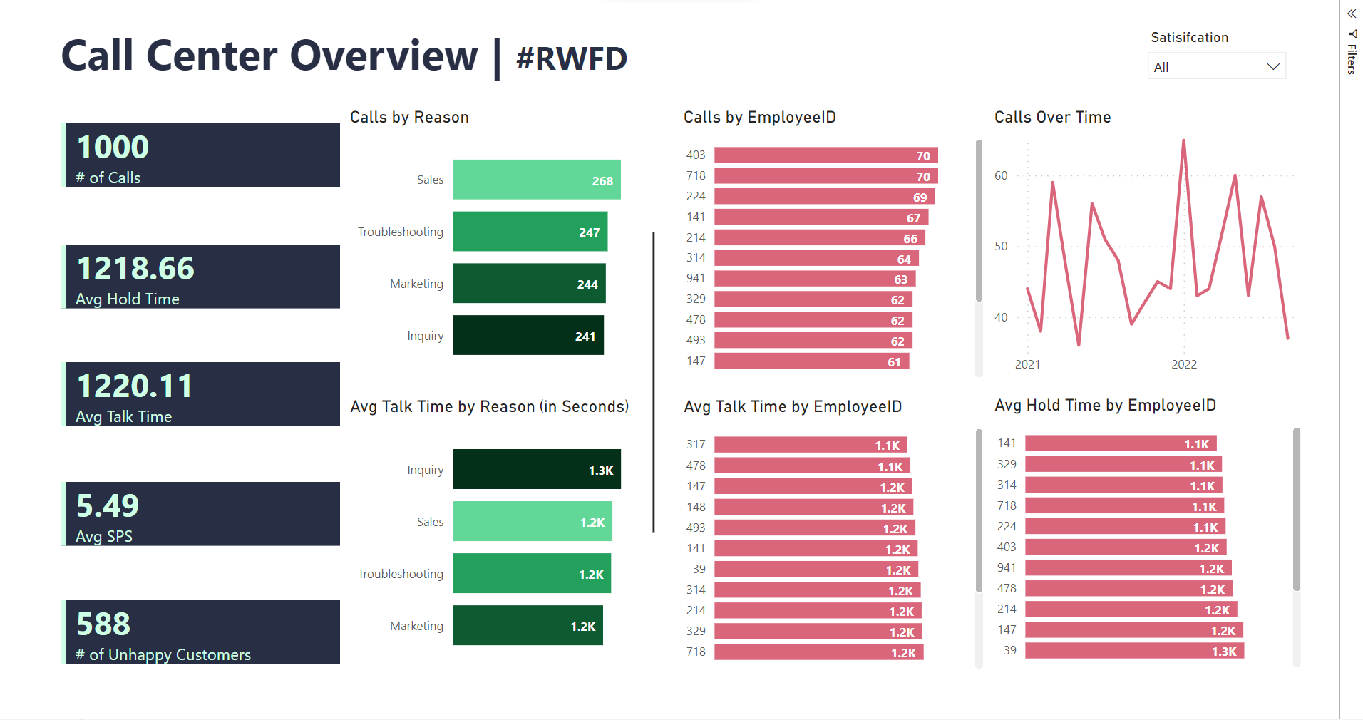
As for the actual project - today we were able to choose an industry and make a visualization in PowerBI in 3 hours. The experience was a bit different but it was fun to learn a new application. The main thing I struggled with was doing Top N filters to show emphasis on color - it seemed like more of a longer process that I did not have time to do. Here's the final result: