This is our first day of dashboard week and we are tasked to create dashboard based on FixMyStreet data. The aim of this dashboard is to help people who may have disabilities or impairments.
How can we make our dashboard more a accessible?
· Use proper color contrast
· Choose color blind safe colors
· Big font size and style
· Careful with Imposter letters (Verdana Is a little better)
· Provide legend titles
· Use caption to clearly describe your chart
· Provide proper instructions on dashboard like where are the filters etc.
Brief overview of Data-
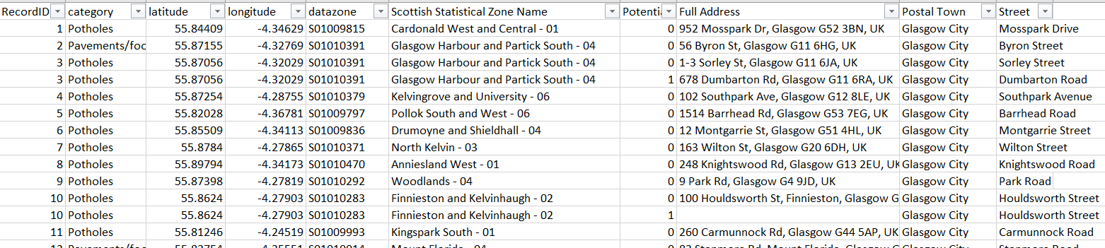
Data is about road repair information of Glasgow City, UK from FixMyStreet. It contains information about the location of potholes in the city.
The Dashboard-
Below dashboard focusses on audience who have visual impairment like color blindness, weak eyesight or blur vision.
The dashboard has following components -
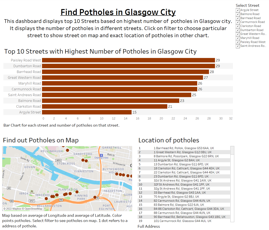
Filter- This filter is universal filter i.e. it is applicable on all three visuals. Users can select specific street/s or all street to see respective information.
Bar Chart- This dashboard is showing top 10 streets of Glasgow city based on number of potholes. First bar chart is showing top 10 streets and number of potholes, for example 'Paisley Road West' and 'Dumbarton Road' streets contains 29 potholes which is highest that's why they are on top.
Map- Map visual is to exactly find out those potholes in map. I have used street view to clearly locate them.
Text Table- This table is telling users exact location/address of those potholes.
Accessibility features which are incorporated are below -
· Small description of dashboard and proper instructions to interact with dashboard.
· Used bigger font size than usual.
· In bar chart and text table, bandings are used to distinguish between rows.
· Bar chart have labeled numbers.
· In map I have used bigger size and distinguishable color for marks to denote potholes to easily identify them on map.
· Used caption in the bottom of every visual. Screen reader can read caption and users can understand the intention of visual without even looking at it.
I hope this blog helps you to understand what accessibility is? And how we can improve our dashboard to increase our audience.
Here is the link of my dashboard on tableau public-https://public.tableau.com/app/profile/pooja.srivastava3278/viz/FindPotholesinGlasgowCity/Dashboard1