


For today's dashboard week assignment, we had to create our own dataset on Mockaroo. Luckily we had had a very good tutorial session on creating mock data with the tool, so it was familiar and I easily found my way around it. Here are some things to bear in mind when creating your schema.
- Remove decimal points for the age field values because it's not realistic otherwise.
- You can very well write formulas. Mockaroo uses Ruby code to generate data based on column logic. I wrote two calculations: one to calculate the COGS (Cost of Goods Sold) as 0.25% of Sales, which made it possible for me to write the next calculation for Mockaroo to generate the values for profit as Sales - COGS.
- You use normal distribution to get the bell curve type of histogram distribution. So for age, for example, you have to give mockaroo what standard deviation (SD) to work with in order for your age distribution to be realistic. I used 50 as my average and if I sepecified 10 as my SD, and I'm one SD away from the mean, then 68.2% of my data would fall within the range of 40 - 60. Two SDs away would result in about 95.4% of my age values falling between 30 - 70 and at three SDs away the age range of my customers would be between 20 and 80.
- There is also something called custom distribution. You can have the numbers in the distribution add up to 10 or 100, so you can reference the spread in percentages. It's like weighting the categories you have. For example, you can weight Technology 1, Groceries 6 and clothing 3. This means that for every 1 iten sold in the technology category, you would sell 6 in grocery and 2 in clothing. Again, this helps Mockaroo create a more realsitic set of values.
- The same goes for Sales. If you simply pick number, the values that might get assigned to Technology may be very small and likewise the opposite for groceries. That wouldn't make any sense, so you have to assign different values for different categories. It's kind of like with the normal distribution bell curve, but here we use scenarios. Make sure you save what you have up to here because if you don't and you click on any of the tabs (scenarios, for example), you'll lose all your data!
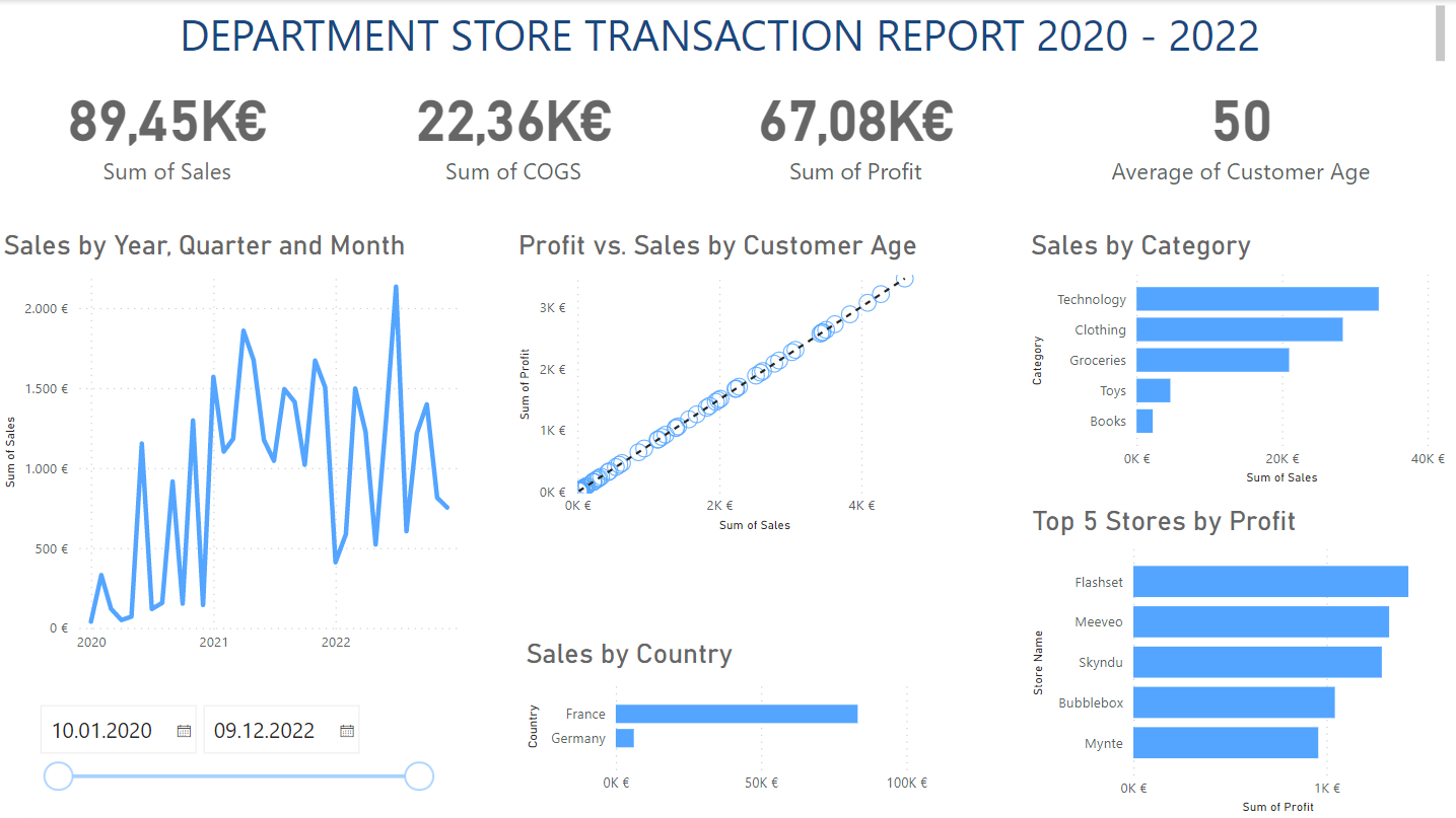
For the second part of the assignment, we had to create a KPI dashboard in Power BI. We had a full day training on Power BI, but it still took some playing around to get used to again. I find Power BI pretty stable. Things just seem to work. I mean, you click on a card and boom, it's on the canvas. Then you drag and drop your measure onto it and boom you have your KPI ready to go - only a few more formatting perfections.
It blows my mind how easy it is to get the charts to filter all by themselves without doing anything. My entire dashboard was dynamic - even the KPIs were changing without my having to write any calculations or even think about it! Even creating the Top N was a click using the basic filter drop down, then clicking on Top, then specifying N and then dragging and dropping the by what measure!
In my opinion, where Tableau shines is in that the charts look prettier, you have more control over the data and you can manipulate it as you wish, and there are many more chart types included without having to rely on third-party plug-ins. For example, I wanted to use a histogram to show the age distribution, but I couldn't because it's not one of the default charts to choose from. Additionally, there is no presentation mode in the desktop version. All in all, it was fun to work with.