


So I've just spent the majority of my Friday morning figuring out how to create a Radar Chart in Tableau, so why not channel that energy into a blog post!
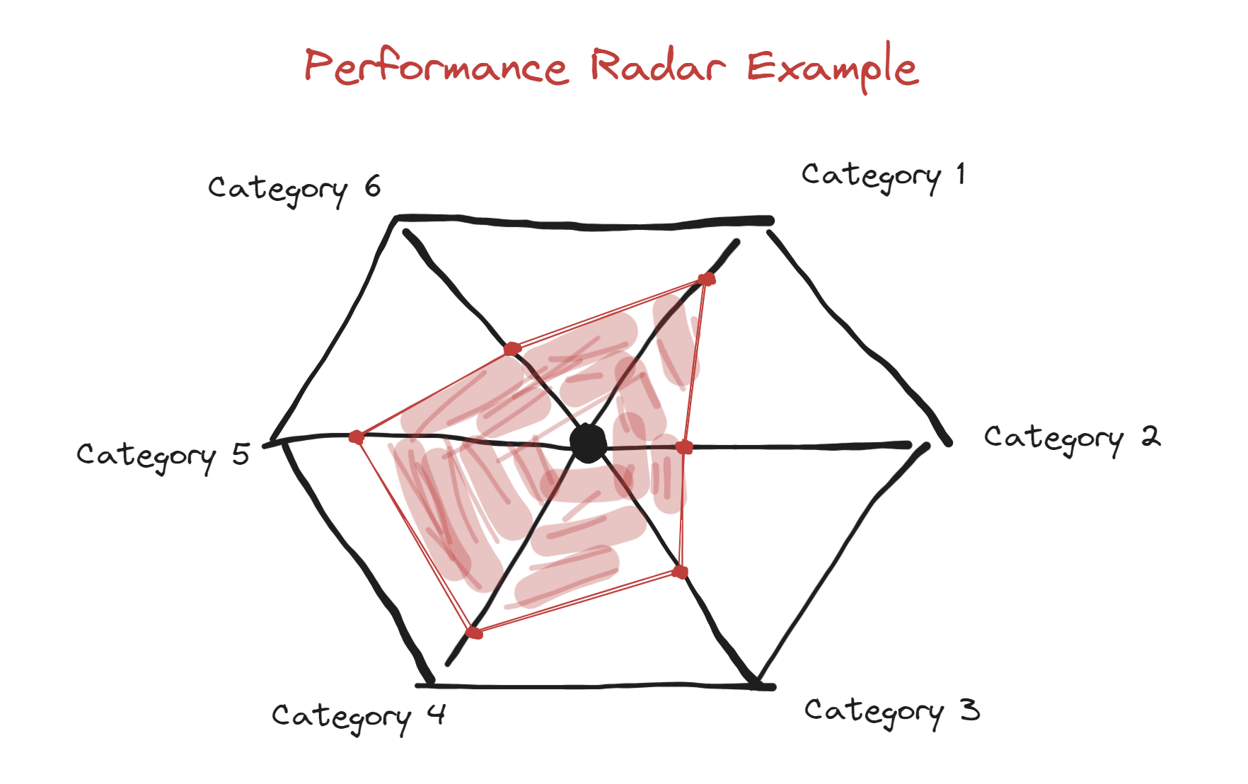
You've probably have seen radar charts on sports shows analysing a player's performance in specific skills. They are a great visual way to show the distribution of common variables compared to bar graphs, which can get a bit stale... The only problem with radar charts is that they are an absolute pain to build!
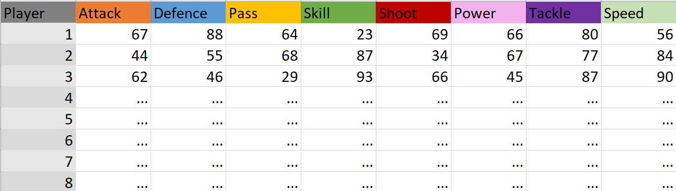
This guide will help you quickly make radar charts in Tableau. I will use a mock-up data set that is looking at football player competency in an array of skills:
Step 0- Preparing the data!
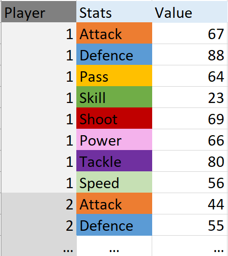
Before we start building the chart, we have to make a slight adjustment to our data. We currently have our stat categories displayed as headers, we need to pivot these in order to have one column/data field with all the stats. This is pretty easy to do in the Data Source section in Tableau simply select all the categories you want to display, right click, then pivot. Now, rename the new headers whatever you want but your data will now look like this (Also, double check that your data types are still correct!).
Step 1- Calculated Fields
Next, I like to create all of the calculated fields in one go to make the chart making a bit smoother. The names of the calculated fields are in bold. If your headers are the same as mine feel free to copy and paste!
Index INDEX()-1
Average Value WINDOW_MAX(AVG([Value]))
Stats Count WINDOW_COUNT(COUNTD([Stats]))
Degree 360/[Stats Count]
Radar Value MAX([Value])/[Average Value]
X_Radar SIN(RADIANS([Index])*[Degree])*[Radar Value]
Y_Radar COS(RADIANS([Index])*[Degree])*[Radar Value]
Step 2- Setting up the Chart
- So the first thing we want to do is add our Player field to the Filters section, set it to show all players, and get it to show on this sheet.
- Next, change your Marks type to Polygon (the symbol with the two squares).
- Drag the Stats field to the Detail button and add Index to the Path button.
- Right click on the Index area to get a drop down, go to compute using, then select Stats.
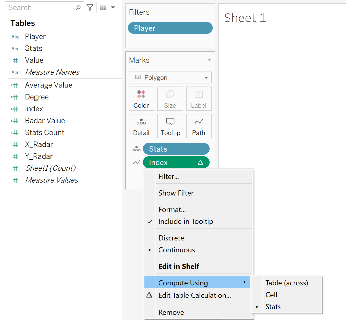
- Move X_Radar to the columns on the top of the sheet.
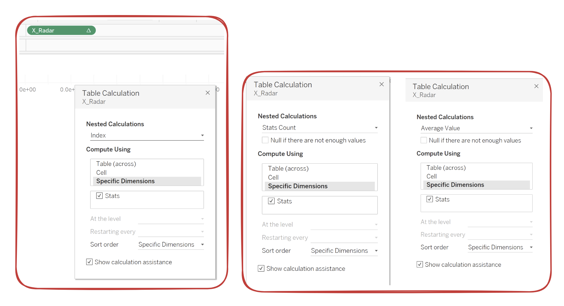
- Right click on it to get a drop down, then select Edit Table Calculation.
- There are three different Nested Calculations to pick from: Index, Stats Count and Average Value. Make sure all three have Specific Dimensions and Stats selected under the Computed Using area.
- Now, move Y_Radar to the Rows section, and repeat the last two steps.
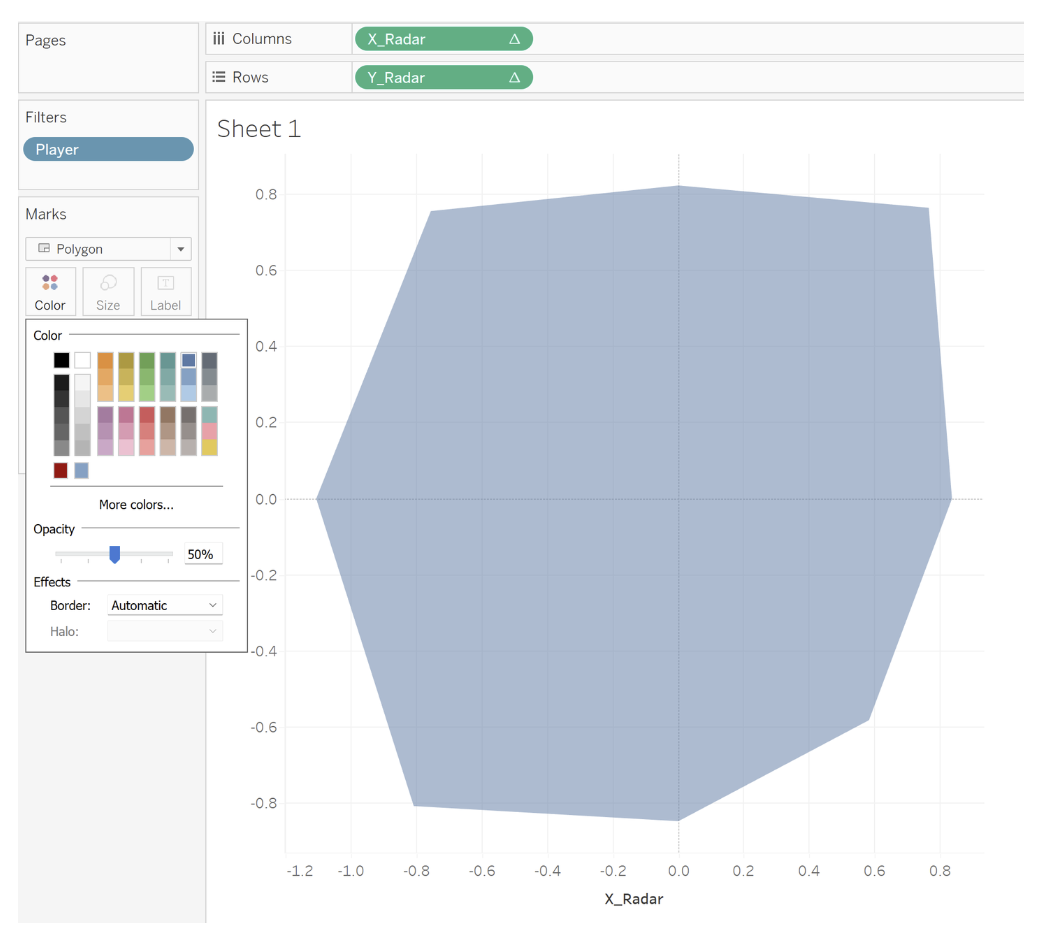
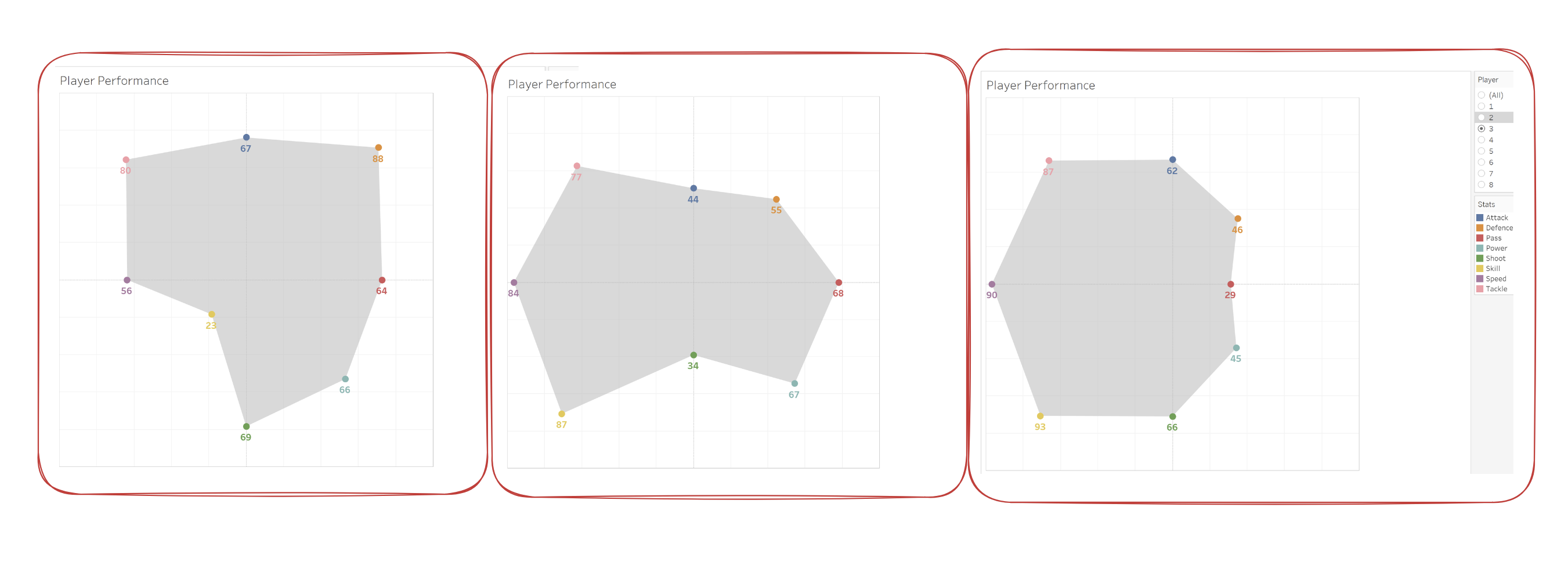
- You should now see an odd-looking polygon shape, if you want to display multiple players at once you can add the Player Field to Colours. You can then reduce the opacity on the Color Mark option.
- Now that we have the outline, we can start making it prettier!
- Hold the ctrl or cmd button and drag the X_Radar measure next to itself, this will duplicate it.
- Right click on the newly created X_Radar and select Dual Axis. Then right click on the actual X axis and select Synchronize Axis.
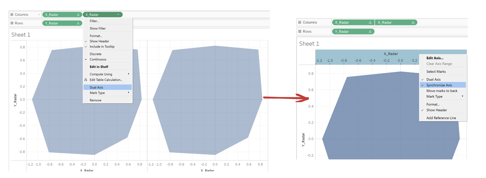
- On the X_Radar (2) section under Marks, change the type from Polygon to Circle, now we have little dots at each point.
Step 3- Let's Get Creative!
- Now this is the part where you can be as artsy as you want!
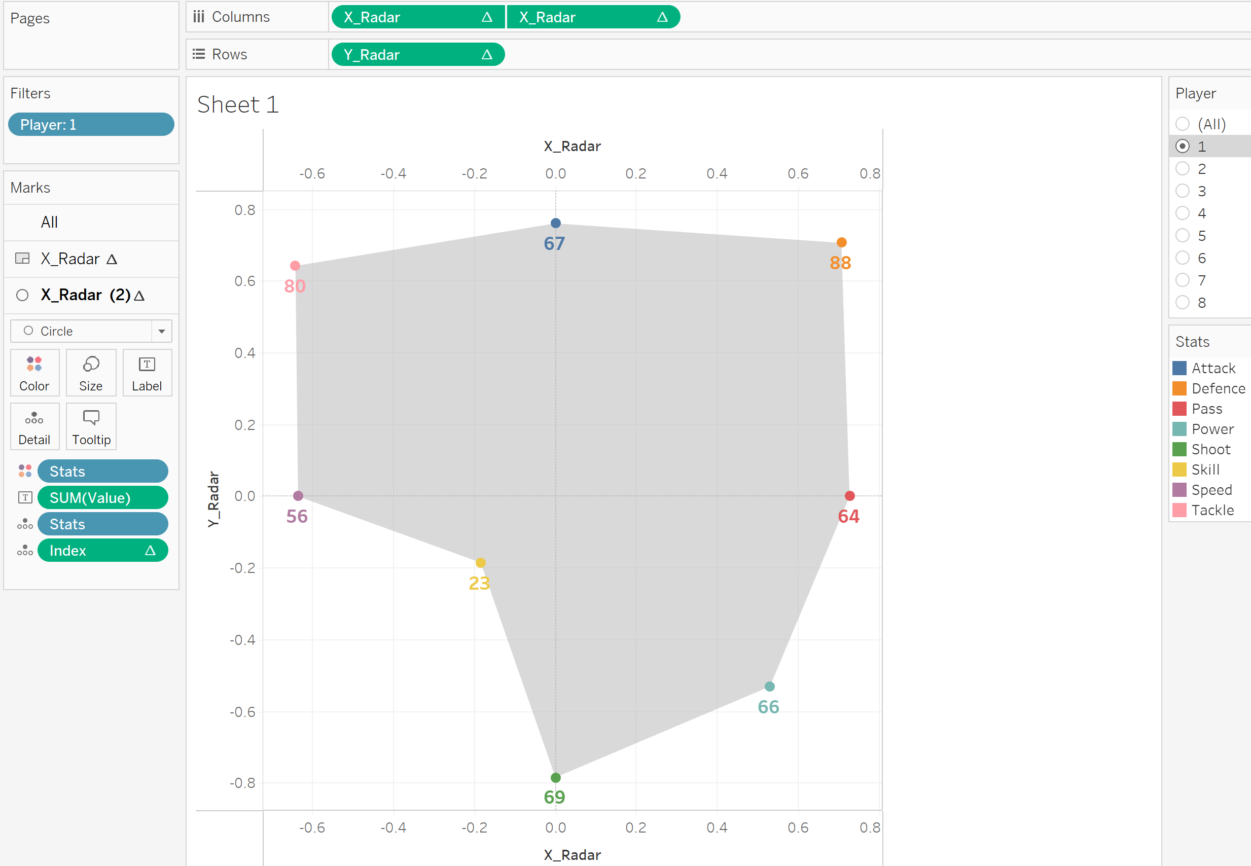
- In my chart, I moved Stats to the Color section and added Value to the Label section, in there you have the option to make your label match your Mark Color.
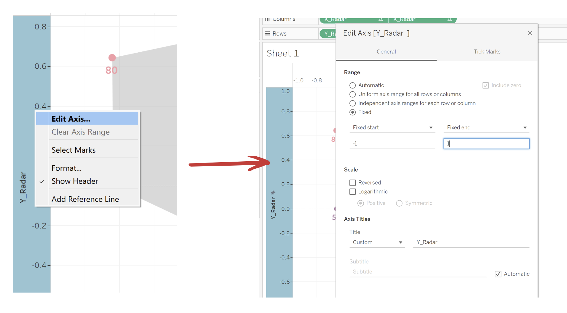
- One final step I would do is to fix your X and Y axis. When you click on different players, the axis will automatically shift to fit the moving polygon. This can get a bit annoying when you want the middle point (0,0) to stay in the center.
- An easy fix is to right click on the axis and set the range to Fixed. In my example, I set it to [-1,1] but this might vary based on your data and how you want yours to look.
Final Thoughts
And that's it! Although they can be tricky, radar charts a great tool to visually engage your audience and allow for easy comparisons. However, it is important to note that having too many categories on a radar chart can look cluttered, making it difficult to interpret. There are also many additions you can add such as an average player score in each category so you know if they are under/over performing. I hope to continually use radar charts in the future!