Intro
The first day of dashboard week is a little different because we a given a session in the morning on accessibility where we learnt a lot of useful tips to help make dashboards and data visualizations more inclusive and not alienate those who are differently abled.
For the evening we were given one of 4 challenges to complete in pairs, and for ours we were tasked with creating a dashboard for the department of health that is accessible to as many people as possible by conforming to W3C guidelines. Our dashboard was to be on Covid-19 new cases data in the UK and it was a new challenge to make a dashboard with these accessibility features in mind.
What we did
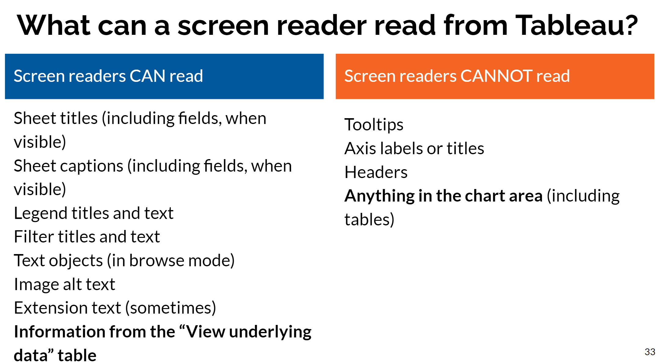
One of the ways we learnt to make it more accessible was to write descriptions of not only what the graphs shows but also explaining the analysis under a chart. This means that those who are blind or visually impaired can still use the dashboard with the help of narrator.
Making the dashboard easier to use with narrator is crucial...
The best tip we learnt was to minimize the number of sheets in the view and there is a lot of useful tips to to achieve this. Firstly, including BANS in the title of sheets, this keeps the number of sheets down to a minimum but also helps them get read by narrators. Another tip is to write graph descriptions in the captions and show them on your dashboard. this again means that for one sheet you have a ban, title, graph and a description/explanation.
There are more basic tips for accessibility that are very helpful such as using larger bond fonts, using colorblind friendly high contrast colours, adding additional differentiators such as shapes to line graphs. and also minimizing interactivity as in can alienate those who are less abled.
Another way to make it more accessible to people is to minimize the level of interactivity on the dashboard, filters, parameters' and even tooltips can exclude people so its best not to include them
Improvements
One change we could have made was to add a download button with instruction on how to use it as many people who were not abled would choose to use a downloaded pdf or excel document.
Another improvement we could have included was some instructions of how a les abled person could use our dashboard.