Second week started with an in-depth dive into graph types and how to make them. Continuing from the data cleaning techniques learnt in the first week, learning which plots to make and how to make them feels like a natural progression as it seems I have now learnt the barebones basics of the end to end process of data visualization.
Pride in progress aside, learning how to make plots in Tableau was a rollercoaster of an experience. Whilst basic plots were easy to learn and quick to produce, more complicated plots quickly became confusing. In particular, when combining multiple fields into dual axes and shared axes, the measure names really threw me off. However, through determination even the hardest moments of having a measure name in the wrong place or a missing category were quickly dealt with, which goes to show the intuitive nature of the program.
All this said, my charge into the world of Tableau has been far easier than my extended experience in the world of RStudio. The ease at which you can combine fields and categories whilst keeping a constant eye on the changes you're making in real time is a game changer.
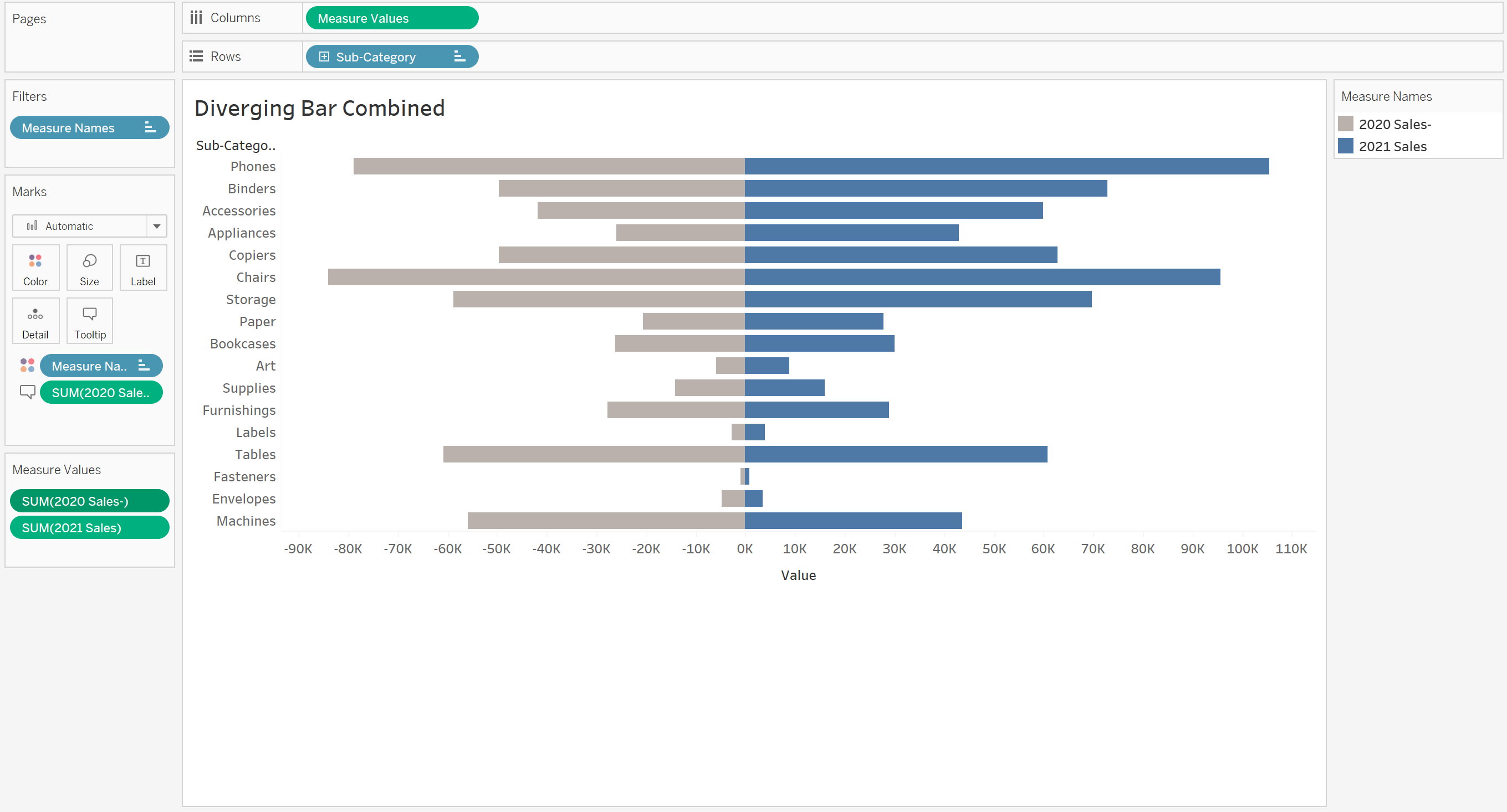
Sharing axes was an early hurdle. Having never done it at any stage of my application to The Information Lab, it was interesting to learn that a relatively short process could leave to such powerful and visually appealing charts. Whilst the combining of the axes initially threw me off with the creation of the measures name, experimenting with it and good instruction meant that the problem was quickly solved. This meant that I could reliably and quickly make a graph that allowed any observer to instantly see the difference between two different fields, which in this example are the sales in the superstore data across different sub-categories and years.
Pro tip from Tom; make sure that the axes are equally spaced either side of zero by adding a max value trend line, else the bars will be squished/stretched, which makes the plot seem different at first glance to what it truly represents.
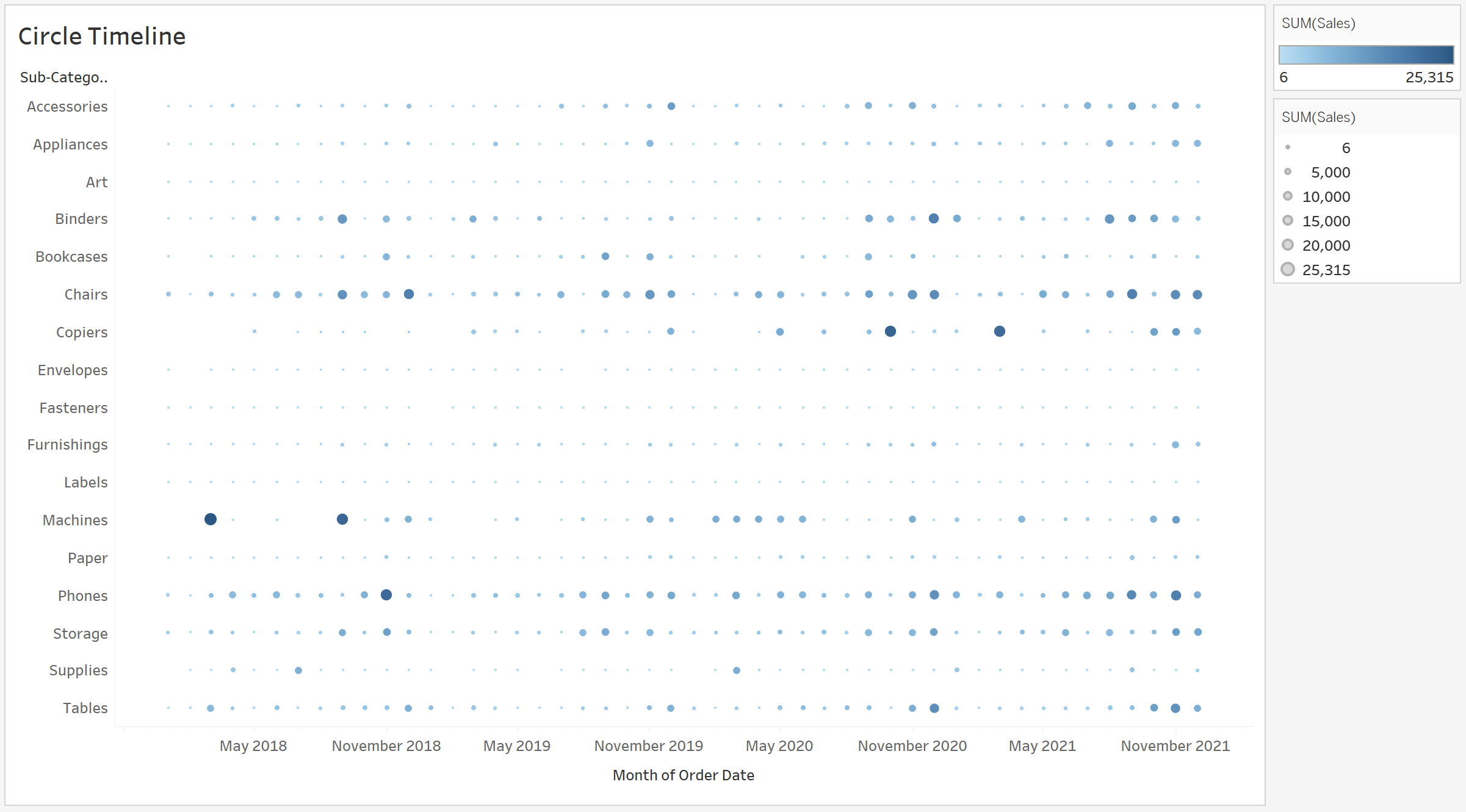
The circle timeline plot was contentious for different reasons. Whilst an easy plot to make and visually appealing, it does not display data in a particularly helpful way. It does allow for anyone to register larger values or basic patterns at a quick glance, but it does not allow for in depth analysis of scores.
Pro tip from Tom; take care when establishing patterns from this type of chart. You can only establish patterns across time as the different categories aren't related to each other.
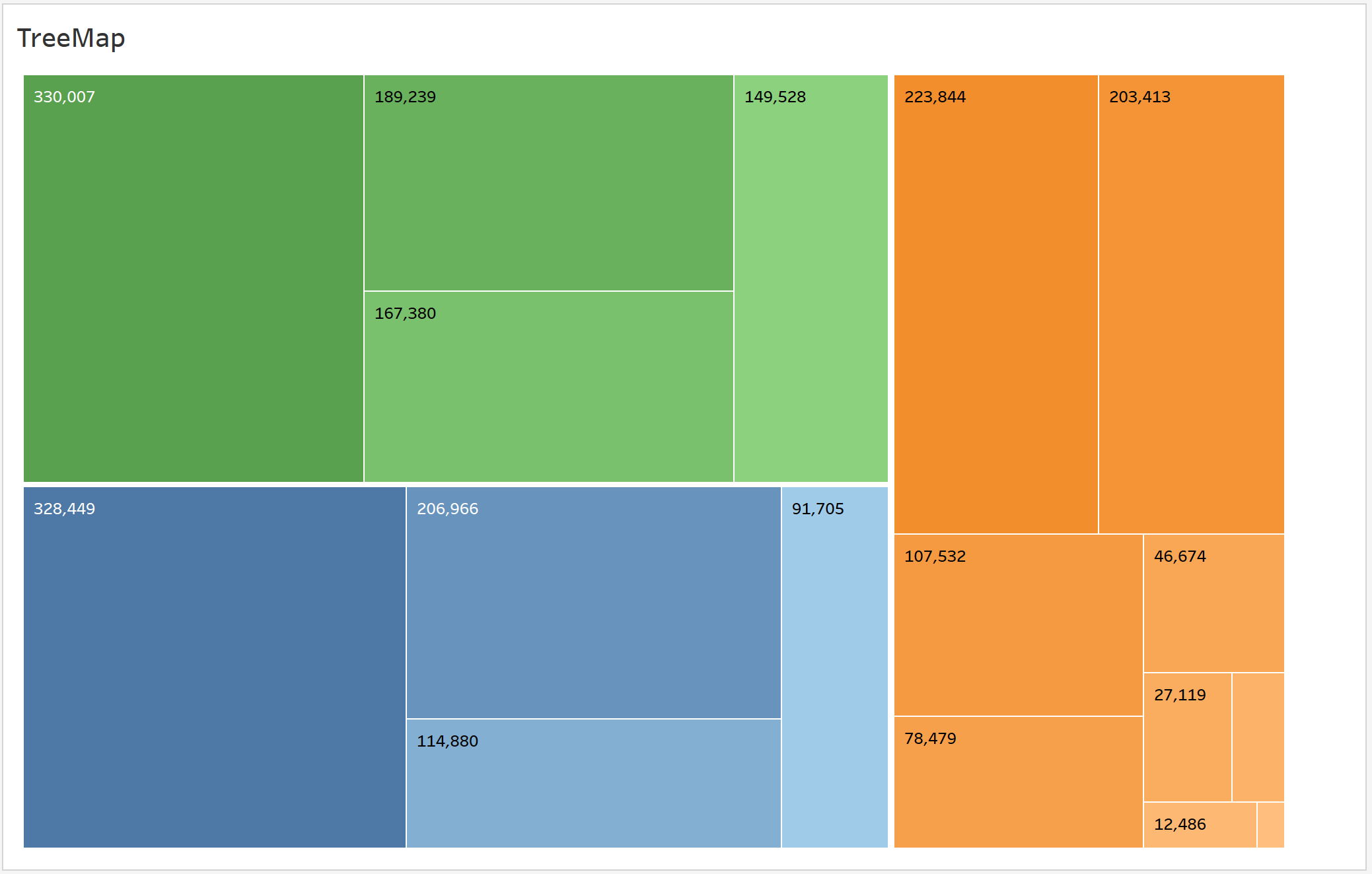
The treemap was another favorite of mine for no reason other than the bright colors caught my eye immediately. This was again an easy chart to produce, and more helpful that the equally eye catching wordcloud, which remarkably similar to produce
Pro tip from Tom; Add color gradient to the sub-categories by clicking on the little icon next to the pill in the marks menu. If you drag it to the color option above it will give each different sub-category a different color, which is both unhelpful and messy.
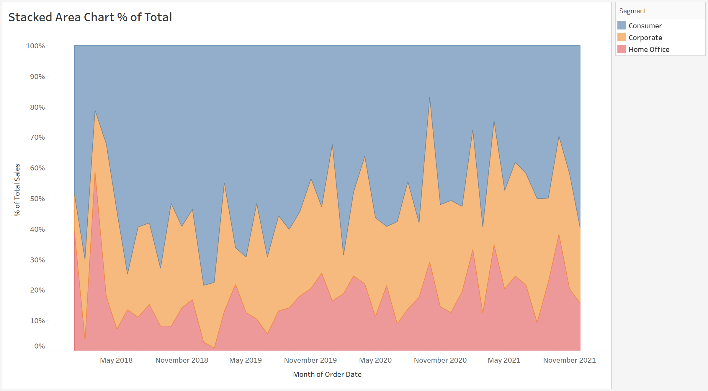
Percentile area graphs are an... interesting... way to display data over time. It's fantastic if you're measuring either the top blue or bottom red sections, but if you want to measure the middle orange section you're at a loss.
Pro tip from Tom; try to keep these graphs to two measures and three at an absolute max. Any more than this and it won't be helpful at all. Also, the stacked area chart without percentage (in my opinion) looks better, if slightly less helpful as you can't measure from the top.
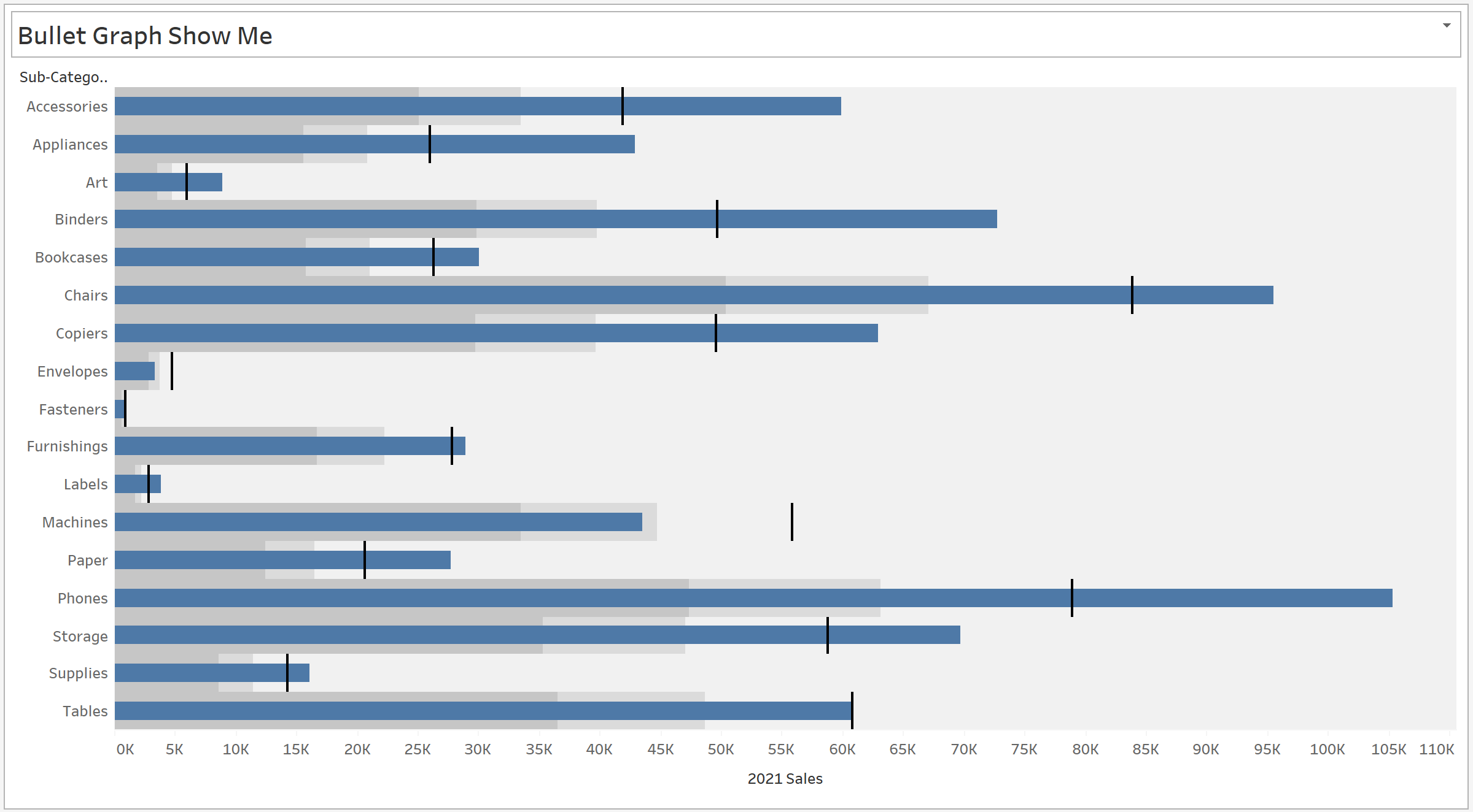
Another chart I'll cover is the bullet graph, which got its name from the fact that the bars look like speeding bullets...? In any case, this is actually a really helpful graph, if a little difficult to produce. There are two ways to do it, and I for some reason chose the more challenging. This means sharing an axes and producing a bar and gantt chart, before adding percentile shading.
Pro tip from Tom; only plot this as a bar graph and then use the constant lines from the analysis section to make the 'bullets'. Far easier than combining the two charts and easier to format too.
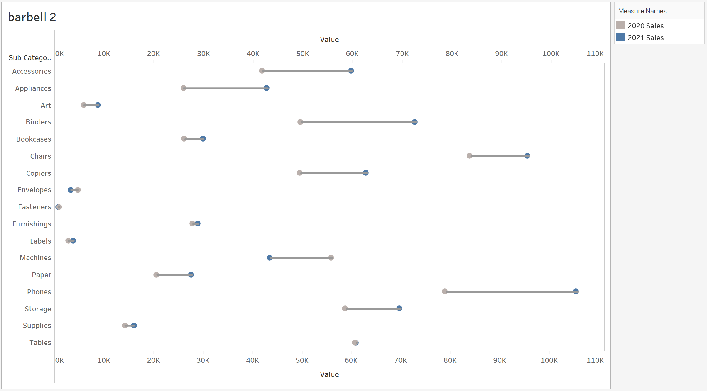
The barbell chart was probably the hardest to produce today, but was so satisfying when done right. The combining of measure names confused me for a while, as did the calculations that had to be made to find the distance between the dots to produce a line, but once it was done it was worth all the effort put in.
Pro tip from Tom; imagine the measure names pill as the entire chart that was produced to make them. It took me a while to wrap my head around it, but when you create dual axes with the measure names you're combining combined charts, and whilst that sounds confusing on paper it makes more sense in practice.