Sometimes it might be nice for the users of your dashboard to not only select certain metrics or parameters for the view but also to change the chart type itself.
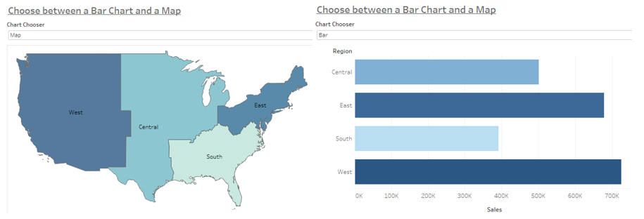
Let’s open up the Sample Superstore data and assume that our users want to be able to choose between a bar chart and a map (both coloured by the sum of sales) when looking at the overall sales per region:
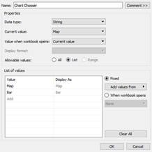
So far, so easy. Next, we need a parameter that will come into action when choosing between the views. Choose the data type “String” and list the options you want to make available to the users.
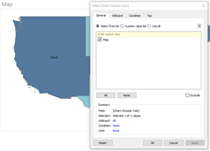
In addition to that we create a calculated field which only contains the name of our parameter. In this case, the calculation simply says [Chart Chooser] in a light purple colour to show that it's a parameter. We’re going to put this calculation to the filter pane for both our sheets and select the according value (there should only be the according value available):
Also, click “Show Parameter” on both sheets as well and check whether it is working as expected. For this example the canvas should be empty when you set the parameter to “Bar” while being on the Map sheet.
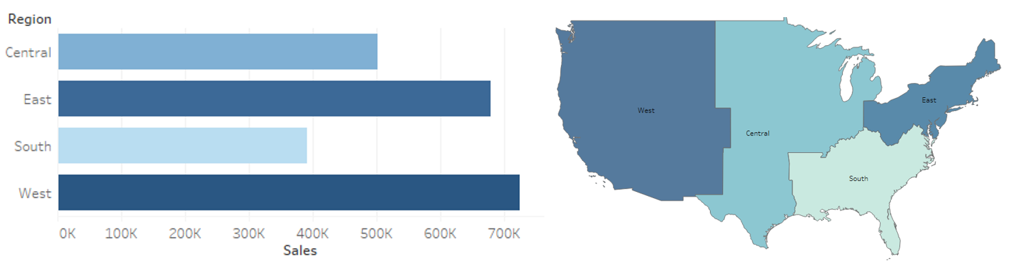
Combining this on a dashboard is quite straight forward, you don't even need to create an action. You simply drag both of the sheets onto the dashboard next to or above/below each other and make sure that the parameter is in the view as well. It is crucial here to make sure that the height or width of the sheets is not fixed so that the view can actually change. Otherwise the chart that is not selected will display an empty canvas on the dashboard and block the view of the selected chart.
The colour legends are a bit tricky here because they will not automatically change accordingly. But that’s something for another blogpost. For now we're fine with the quick Chart Chooser Dashboard we created: