I recently came across a few useful tips about managing chart size on the dashboard when filters are applied. When you use filter on a graph or use filter action to show or hide additional chart, there are a few different ways to make sure that the size of the chart either changes or remains fixed. Here they are.
1. If you simply drag a sheet that is set to ‘Entire View’ onto dashboard and then try to adjust the number of items on the graph by using a filter, your graph is going to resize. The bars will become thicker, or, in other words, the graph will fill up all of the available space on the dashboard.
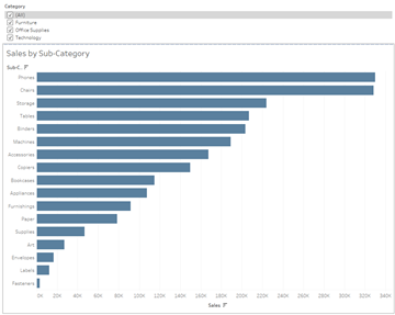
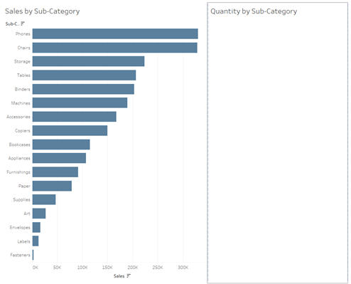
Here all the categories are selected.
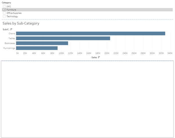
Here only “Furniture” category is selected. You can see how the size of the bars increased and the sheet maintained the same dimensions.
If that is the look you are after, great! You can close the blog and carry on dashboarding.
2. However, sometimes we want the size of the bars to remain the same when items are removed from the view. In other words, we want to sheet with the graph to resize to maintain the same length and width of the bars. In that case we need to put the graph in a container together with a blank dashboard object.
Now every time we reduce the number of items in the view using a filter, the blank object will expand filling up the space that was left by the sheet as the graph contracts. That is, the bars will maintain the same with and length.
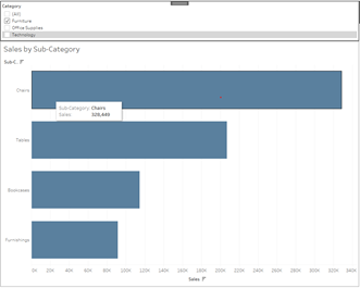
Other times we may be using something slightly more complex, like filter actions. Filter actions allow you to use one graph to filter another one. For instance, we can use our “Sales by Sub-Category” graph to select Sub-Category we are interested in and view the Profits for it in a separate chart.
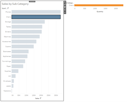
3. Let’s start with simply dragging “Sales by Sub-Category” graph and “Quantity by Sub-Category” on the dashboard side-by-side. Once you set up your action you should have something like this:
Since no Sub-Category is selected in the “Sales” graph, there is nothing in the “Quantity by Sub-Category” graph either. If we select a Sub-Category in “Sales” graph, a lonely bar chart on the right with quantity appears.
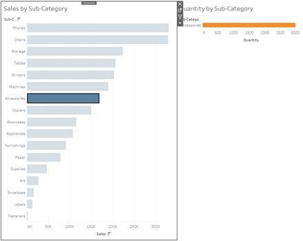
Notice that the size of the graphs did not change. The blank space on the right was simply populated with a bar for quantity. It is also important to note, that the orange chart is set to “standard” view.
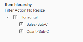
4. A different way to deal with action filters is by using a container to ensure that when no Sub-Categories are selected, the whole space is occupied by the “Sales by Sub-Category” graph. First drag a container on the dashboard, and then populate that container with sales and quantity graphs side-by-side.
Make sure to hide the title of your second, quantity graph and set up your filter action. Now when you do not have anything selected on your sales graph it will populate the whole area in the container.
When you select a Sub-Category, the quantity graph will appear on the right hand side and the sales graph will contract.
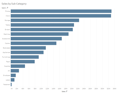
Clearing the selection will expand the first graph again to populate the whole area of the container.