


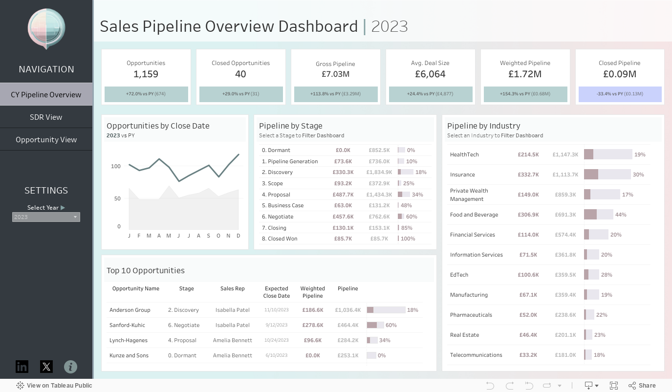
Ever wondered what goes into the process of building a Tableau dashboard? From creating fake data, to designing an eye-catching viz - I'm going to take you through all the steps I took to create this Sales Pipeline Dashboard:
Creating the Data
One of the most frustrating steps of creating a dashboard is often finding the data. There's been plenty of times that I've struggled finding the data, and a great solution to this is to create your own!
I've found that creating your own data not only allows you to bring in any insights you might have from your day to day work - for me, I've worked with plenty real sales pipeline data to know what I want to see; but also, creating your own data allows you to create a dataset that can then be used by others in their viz journeys!
So, how to go about it? My first steps with creating a dataset are to decide what fields I want to include! There's a few ways I go about doing this:
- Looking at relevant dashboards on Tableau public to see what fields other people might use.
- Researching key KPIs to include in the type of dashboard I'm building by having a google!
- Asking ChatGPT for some help!
For this Sales Pipeline dashboard, I relied on ChatGPT quite a bit. My first prompt that I asked it was:
'What variables would I expect to have in a sales pipeline dataset?'
To which it gave me a very cohesive list of variables. Step 1 - done!
The next stage of creating my fake data was done in Mockaroo - a great website that allows to to create mock data easily. I started here by inputting all of my variable names based on what ChatGPT had told me, and then went about telling Mockaroo what each variable should look like. I used ChatGPT again here to tell me what what categories a field should contain, give fake names for my Sales Reps etc., and decide on the weighting for each stage in my sales pipeline.
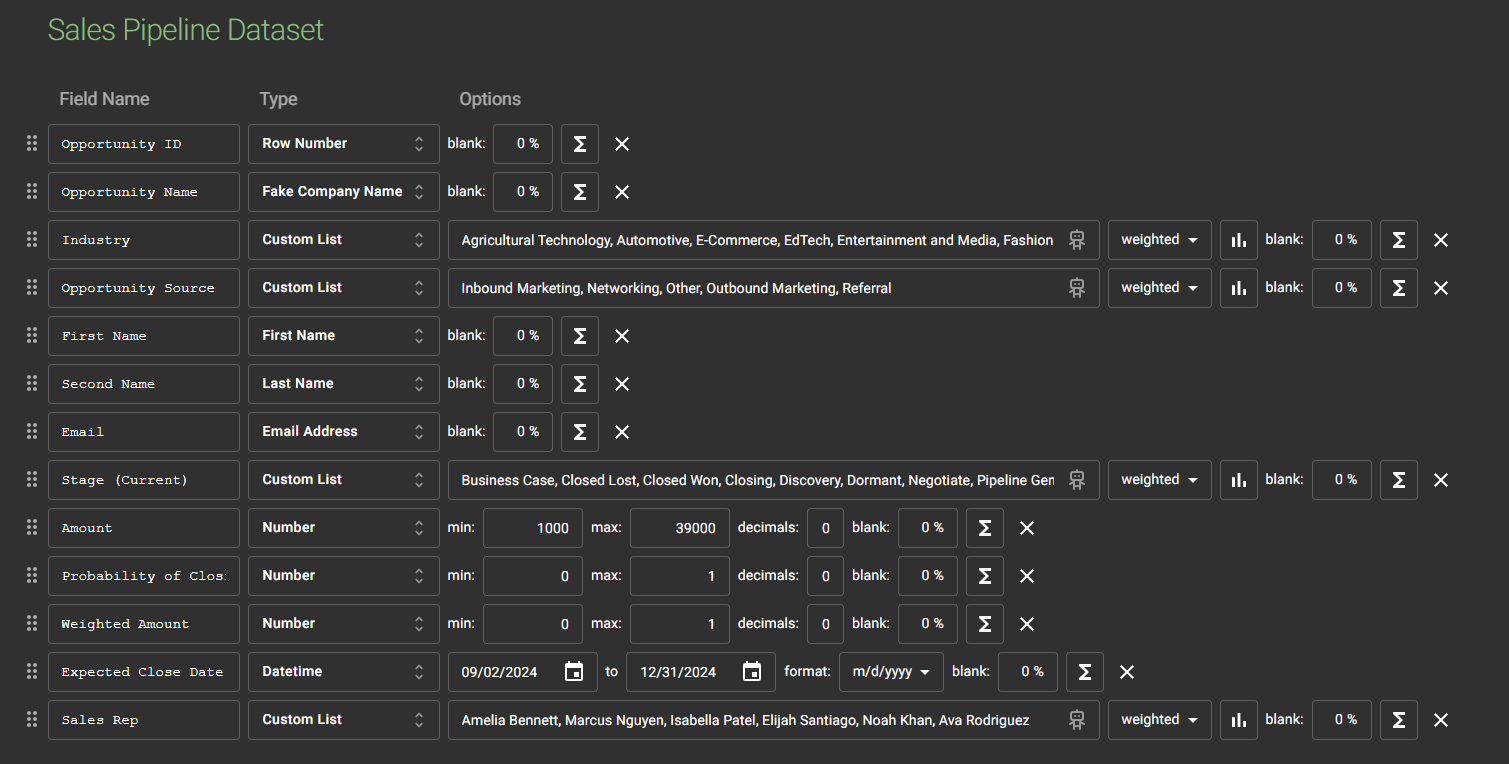
I wanted to make sure that I had suitable trends in the data, and that my variables all related to one another appropriately, so the first thing I did was to incorporate a temporal trend by creating 5 batches of fake data for decreasing time frames:
- Batch 1: Jan 2022 - Dec 2022
- Batch 2: Jan 2023 - Sep 2023
- Batch 3: Sep 2023 - Apr 2024
- Batch 4: Apr 2024 - Sep 2024
- Batch 5: Sep 2024 - Dec 2024
By creating 5 sets of 1000 rows of data (the max you can create per dataset in Mockaroo) with decreasing time intervals I was able to set temporal trends in my data e.g. increasing Sales opportunities, increasing size of deals, shifting top Sales Reps.
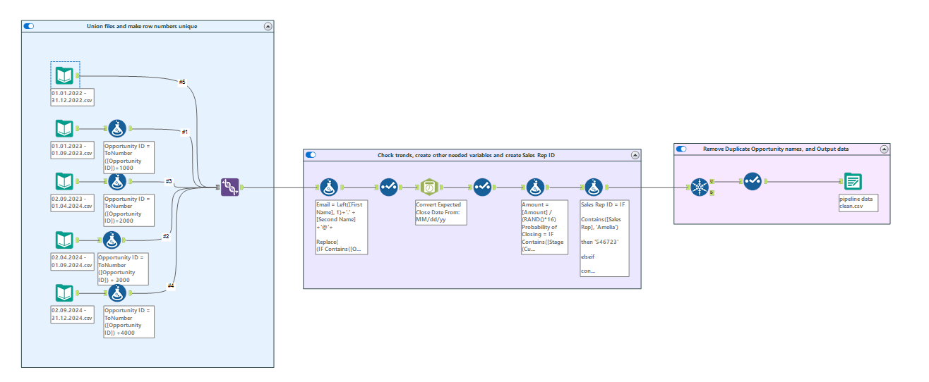
The next step I took to ensure I had appropriate trends was to bring all the files I had created into Alteryx. Here I unioned the files together to create one big file and then added some fields that I couldn't make in Mockaroo - such as an ID number that depended on the Sales Rep Name. I checked some of the ranges of my variables, and then made any edits necessary to ensure the values all made sense.
Finally, because I had made 5 batches of datasets in Mockaroo, some of the opportunity names that had been created were duplicated so I made sure to remove those, before outputting the data ready to be brought into Tableau!
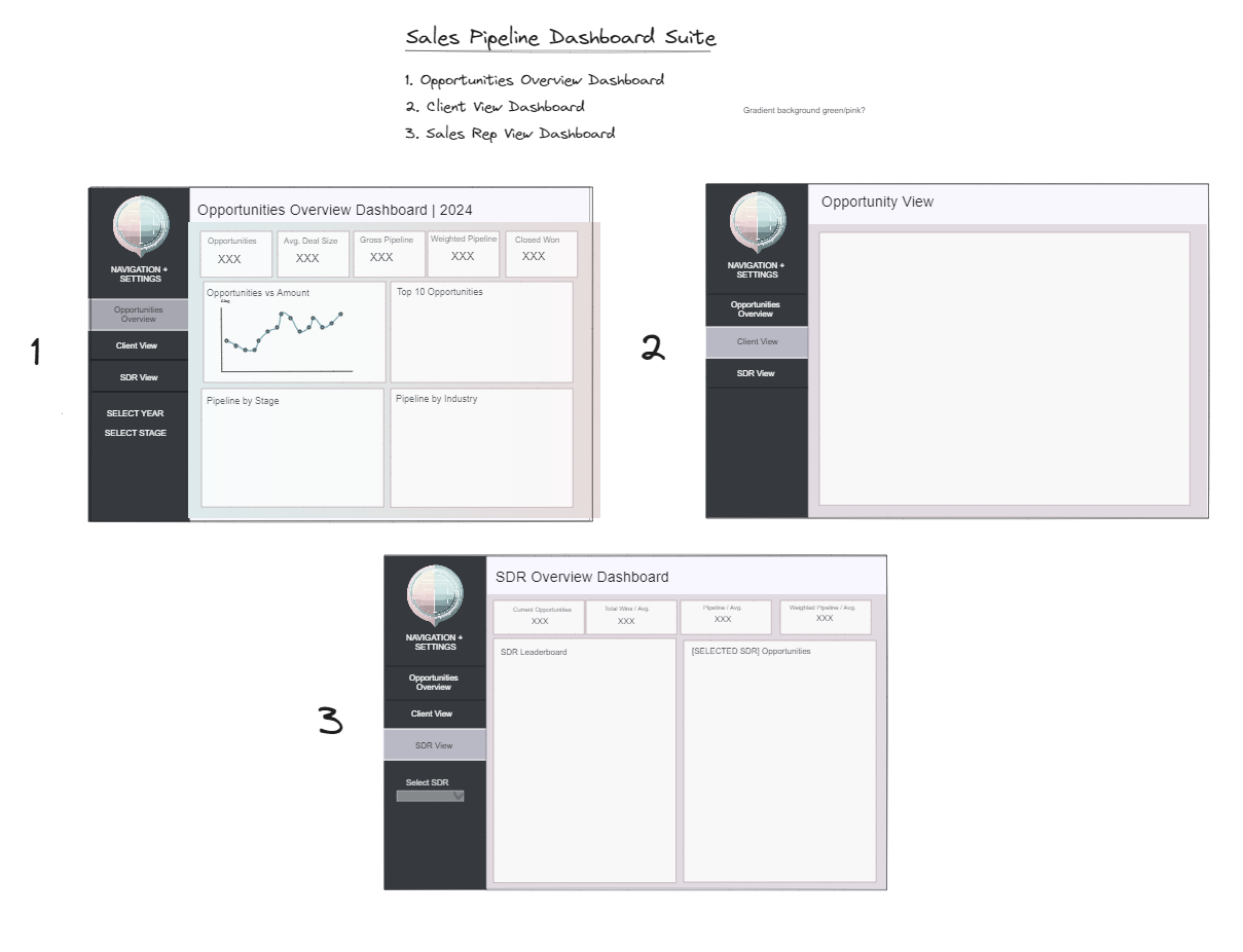
Sketching the Dashboard
Once my data was ready, I brought it straight into Tableau and had a little play around with it to get an idea as to what type of fields I wanted to include. I then went straight to the drawing board to sketch up my ideas for my dashboard. This is a really important step in building a great dashboard as it allows you to get your ideas down and make iterations, before building the whole thing in Tableau, deciding you don't like it then going back to the drawing board. It's also a great tip when designing a dashboard for someone else - getting them to check a sketch and make any necessary changes before you spend lots of time building it!
I used Excalidraw to sketch up my dashboard design, and plan how I wanted to layout my dashboard. I already had a pretty strong idea of the charts I wanted for each section so I didn't sketch these up, but I did sketch up the overall layout and design.
I also decided I wanted to create a company logo for my dashboard, so took this as another great opportunity to use AI! Adobe Firefly is a free AI image generator which is great to use when adding custom images to your vizzes. I asked Firefly to create me:
'a company logo for an information technology software company on a transparent background, clean and simple design'
And it came up with this:
I really liked the colours Firefly came up with for this logo so decided to use them to create an appealing background colour for my viz. I made this using Figma, a design tool useful for creating custom images and backgrounds to your viz. Using the colours from my logo I created a diverging background to fit the size of the dashboard I was going to build, so I could bring it in as a background image and build my viz on top of it!
I then included my logo and background in my dashboard sketch and was ready to go into Tableau:
Into Tableau!
Data - done. Sketch - done. Design - done. All that was left to do was actually build the dashboard!
With this dashboard I started by building all the charts for the first dashboard page - the Opportunities Overview Dashboard. I built up my dashboard template and made a copy for the other two dashboards, then started bringing in my charts and moving them around to make sure I got the best fit for each chart.
After finishing the first dashboard page I hid all my sheets and moved onto the second one. I find this a better way of working as I have a navigational nightmare when I have 30+ sheets in one workbook, so I like to hide them as I go. I repeated this for the second dashboard page and then when I finished the third page, went back through each dashboard and made any necessary iterations to sheets - from formatting, to changing my filter choices.
I then went through my final checklist to make sure my dashboard was publish ready:
- Checking the alignment - making sure that the alignment of charts and sections was perfect, and that all charts had equal spacing between them.
- Checking consistency - making sure that the text sizes, fonts, colours etc. were consistent across every chart and every dashboard.
- Checking all my filters worked as intended.
- Checking my tooltips were all formatted (an easy one to forget!).
With all of these checked off I was ready to publish my dashboard to Tableau Public. You can check it out here.
And that is the process I took to create my Sales Pipeline dashboard! Hopefully you've found this blog insightful and maybe even useful!
If you'd like to use the Sales Pipeline data I created, you can find it here.