Want to make a pie chart? Donut make that mistake! Donut charts grant a more professional look to your dashboard. They're quick and easy to make in Tableau and I'll show you how.
Step 1
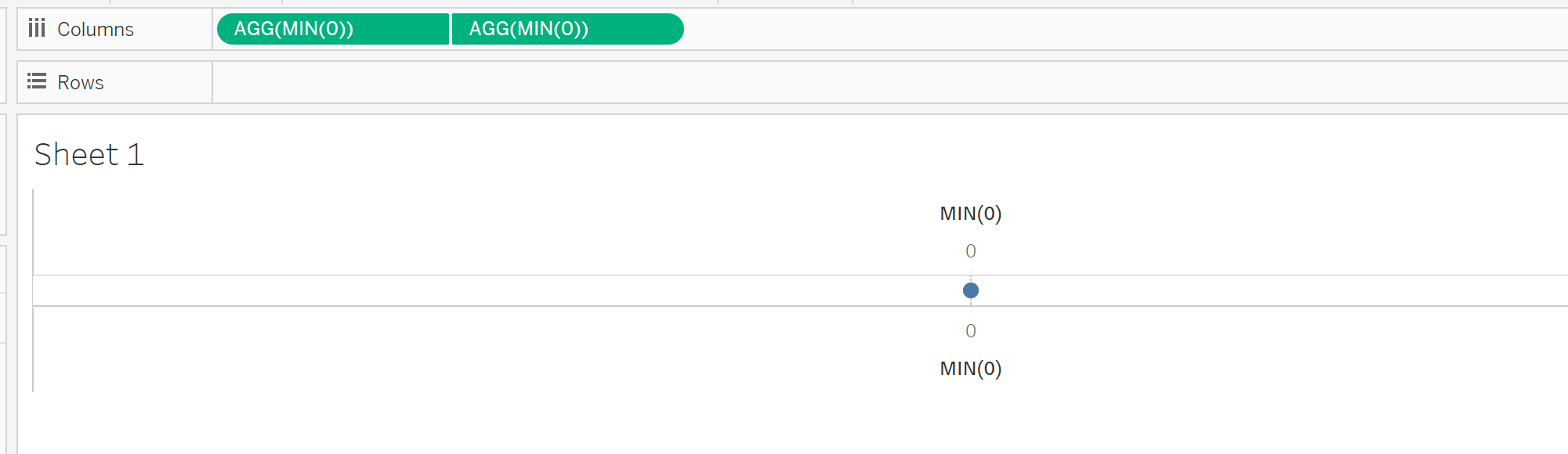
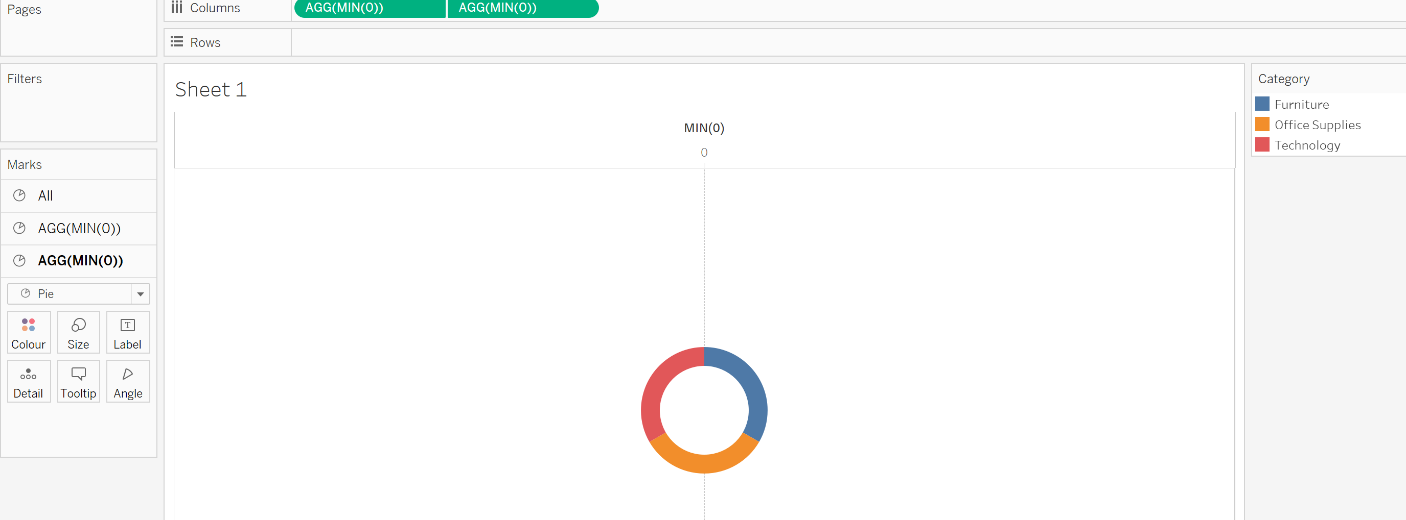
I'll be using the sample superstore data for our example below. Firstly, we want to create and join two 'dummy' fields to create two layers to our chart. This will allow us to make a blank pie chart within another to give our donut effect.
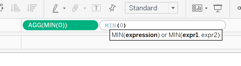
Input MIN(0) twice into columns and create a dual axis (don't forget to synchronise)
Step 2
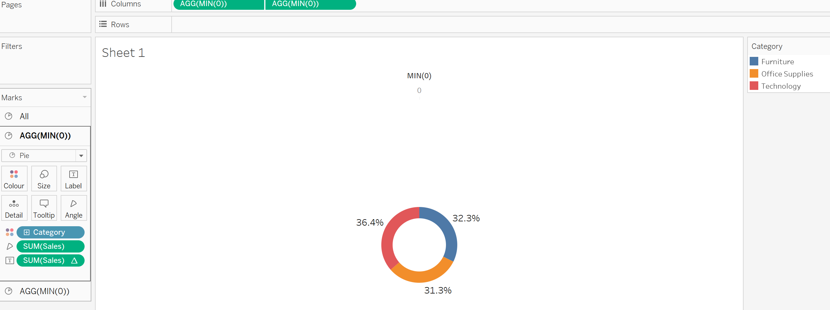
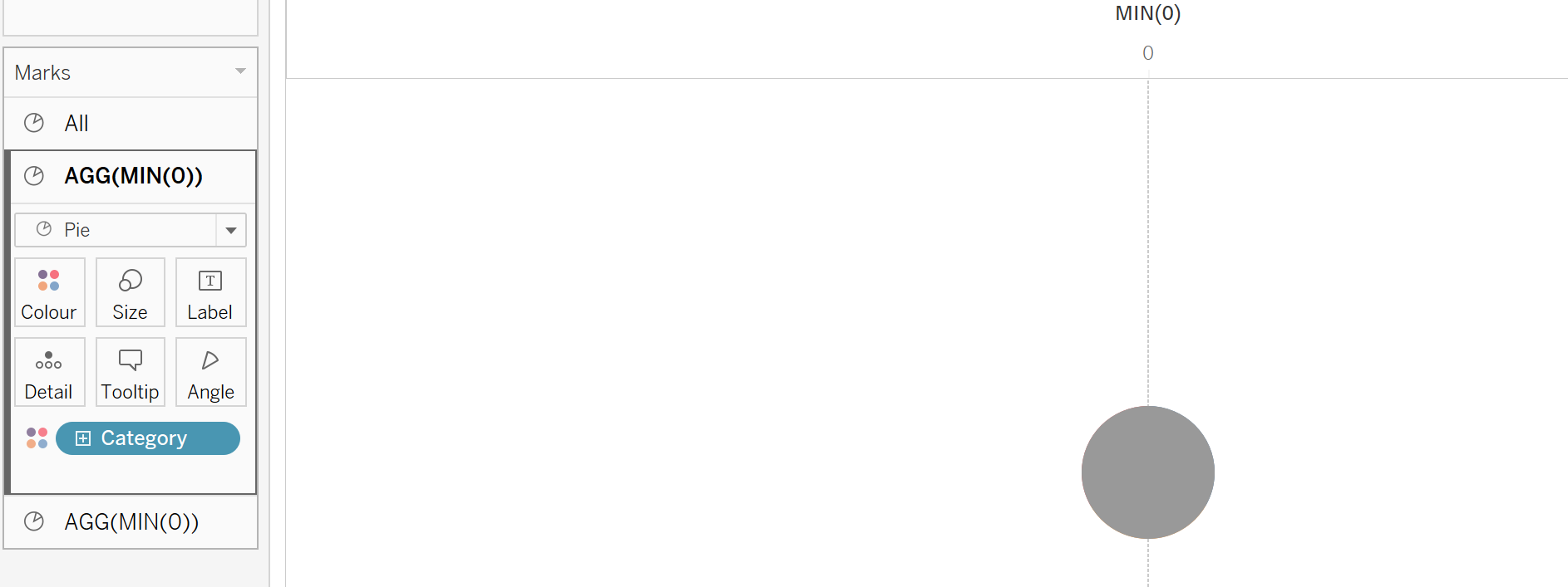
Now we have our two layers, we need to input our data to create our pie charts. Input your desired fields onto your top layer, I have chosen to split the chart by category, whilst representing sales. Do to this add category to the colour shelf and select pie chart.
On your second layer, reduce the size to reveal the layer behind (first) and we can start to see the donut effect take shape. I have also changed this layers pie chart colour to white:
Step 3
Finally, we need to format and add our sales to create our finished donut chart. I have added sales to the angle shelf on our first layer to include these values in the view. I have also added sales to Label to give a clear indication of how the donut chart is divided (percent of total table calculation was also applied).
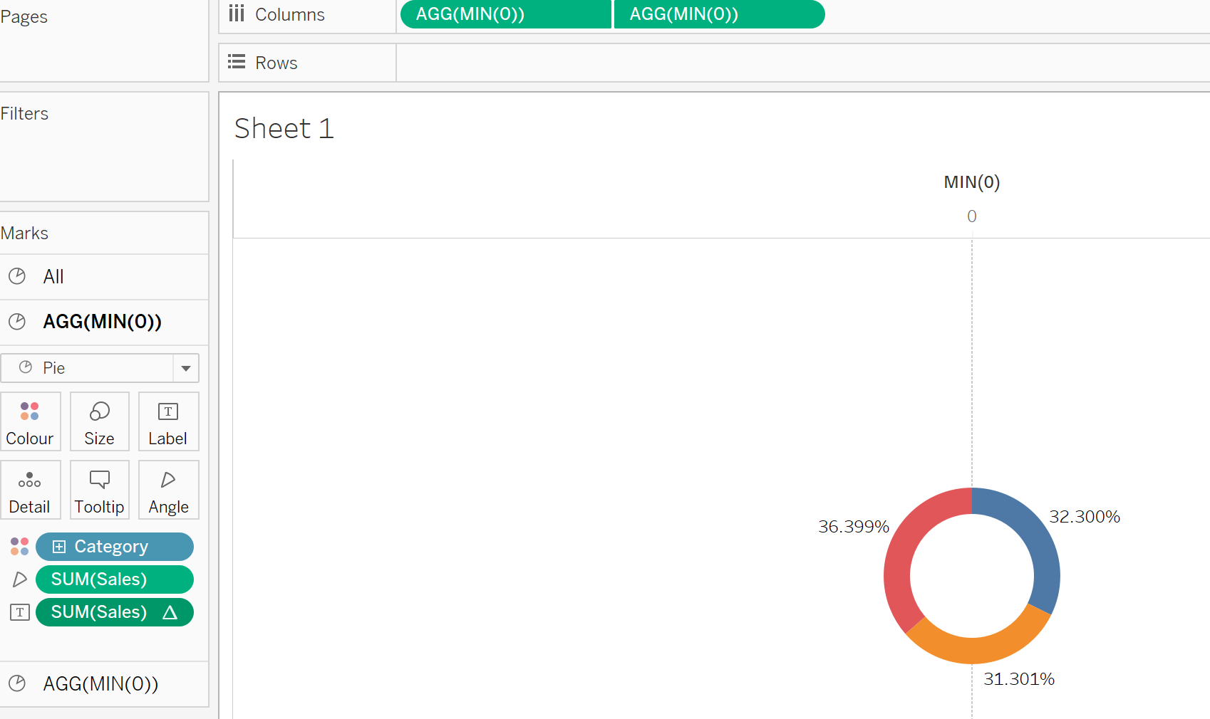
I then changed our percentages to 1 decimal place and removed row/column dividers and grid lines to give us our final donut chart. Further design is only limited by your creative ability! Experiment with the donut width, colour and labels to create your desired donut, yummy!