Recently I've been browsing through Pinterest and saw a see-saw chart that caught my attention since I've never seen anything like this before on Tableau. So I decided to make it for one of the Makeover Mondays. Here's how I created it.
Dataset: https://data.world/makeovermonday/2023w13
How to...
Step 1: Data Prep
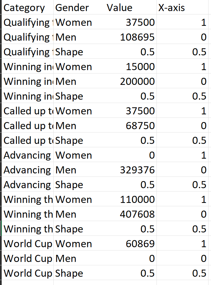
Manipulate the data in a way so that you have the following columns:
- Category: have a column for the different categories you'd like to compare the 2 genders by (Category)
- Gender: have female and male, and create a 'Shape' in the gender column. The shape is going to be the triangle of the see-saw.
- Values: these are the original values from the dataset for the 2 genders and for the shape I just set the value for 0.5 (this can be changed later)
- X-axis: for Women I set this value for 1, for Men 0, and for Shape 0.5. This makes sure Women stay on the right side, Men on the left and the Shape in the middle.
Step 2: Create the calculations that will create the Y-axis
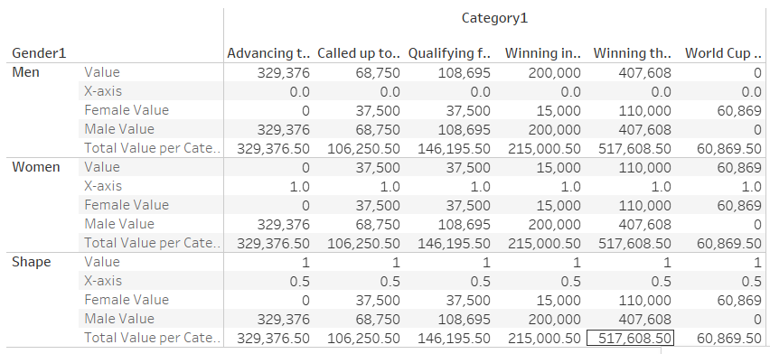
Let's create a table first to see all the calculations.
- Drag Category on Columns, Gender on rows, Values & X-axis fields on the text mark.
- Create fixed LODs for the women, men, and total per category values:
-Female Value: {FIXED [Category1]: sum(if [Gender1]='Women' then Value END)}
-Male Value: {FIXED [Category1]: sum(if [Gender1]='Men' then Value END)}
-Total Value per Category: {FIXED [Category1]: SUM([Value])}
-Drag these into the text mark - How the table should look so far:
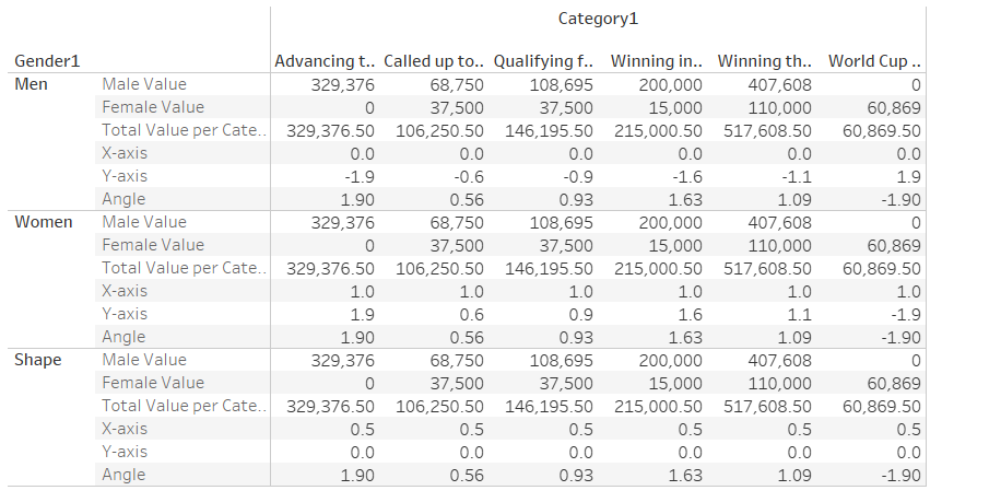
- Create the Angle of the line of the see-saw, which is determined by the percent difference of the total: (([Male Value]-[Female Value])/[Total Value per Category])
- if the slope of the line is not visualizing the gender pay gap enough the Angle could be multiplied by a constant e.g., I multiplied mine by 1.9 - Create the Y-axis to determine the vertical position of the Genders by adding the angle to 0 when the Gender is Men, subtracting the angle from 0 when Gender is Women and keeping it on 0 when Gender is Shape:
if [Gender1]='Men' then
0-[Angle]
ELSEif
[Gender1]='Women' then
0+[Angle]
ELSE
0
END - Drag these into the text mark
- How the table should look so far:
Step 3: Time to make the chart
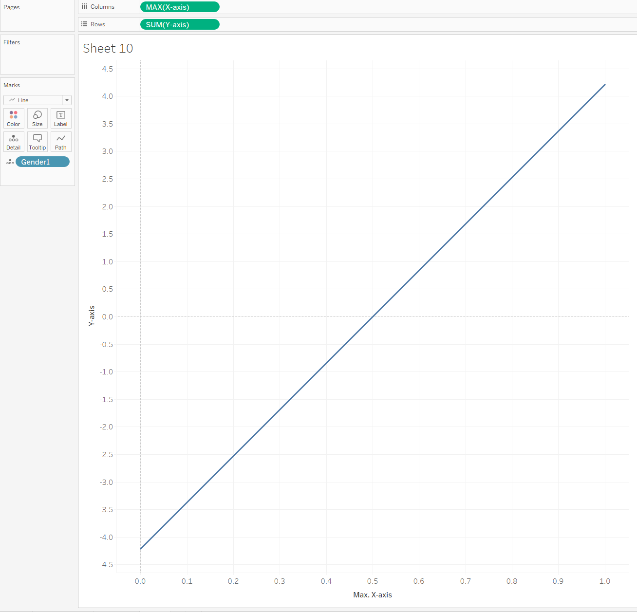
- Drag the X-axis into Columns and change the measure to MAX
- Drag the Y-axis into Rows
- Drag Gender on the Detail mark card
- Change the chart into a line chart
- Now you have your line!
- Drag the Y-axis into Rows again
- Drag Gender on the Detail, Shape, Colour and Size mark card
- Change the chart into Shape chart
- Change the shapes of Gender: Shape into triangle, Women and Men into circles
- Change the size of the Gender so that Shape is the largest size
- Change the colour of the triangle into a colour you prefer, and the circles into the background colour
- Dual axis the 2 charts
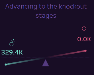
- Put Category into Filters and choose a category
- Fix the Y-axis axis range for the line chart
- Fix the Y-axis axis range so that the triangle is low enough to not overlap the line
- Congrats now you have a see-saw chart that changes with the filter!
Step 4: Format however you prefer!
Check out the dashboard that I made with this data: https://public.tableau.com/views/MakeoverMonday2023Week13-GenderPayGapleverchart/OverviewDash?:language=en-US&:display_count=n&:origin=viz_share_link