Happy Pride Month! ❤️🧡💛💚💙💜🖤
To celebrate this month of love, acceptance, togetherness, and joy, I did what I do best - design Tableau vizzes!
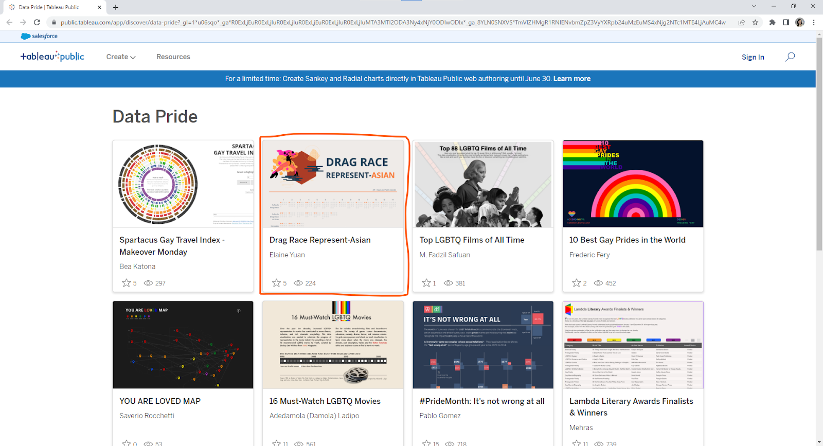
I started this month off strong with a Drag Race Represent-Asian viz, which was featured in the Data Pride gallery.
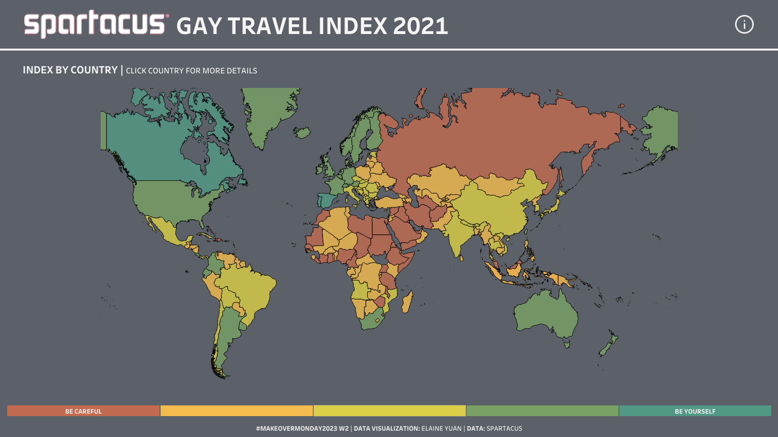
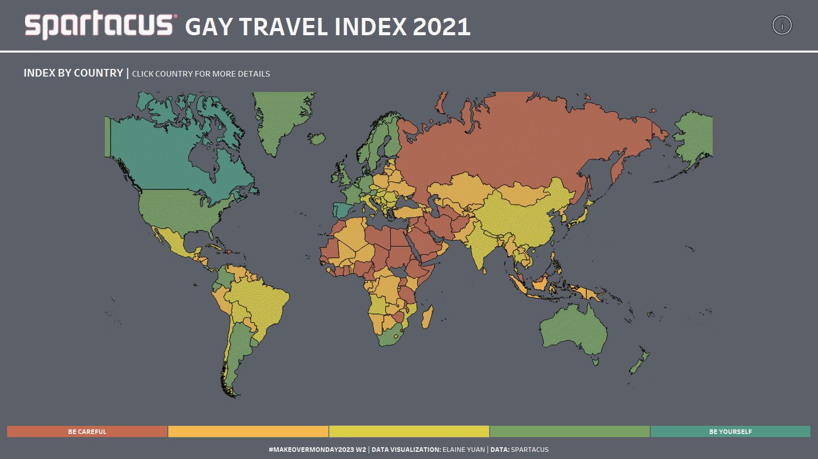
Spartacus Gay Travel Index 2021
Later in the month, I completed this Makeover Monday challenge: https://data.world/makeovermonday/2023w2
The challenge was to re-visualize the Spartacus Gay Travel Index, which informs travellers about the situation of lesbians, gays, bisexuals and transgender (LGBT) in a total of 202 countries and regions.
Like the original visualization, I employed a map. As I wanted to add more context to the visualization, I implemented dynamic zone visibility to introduce a bump chart and heat map to show change over time.
You Are Loved
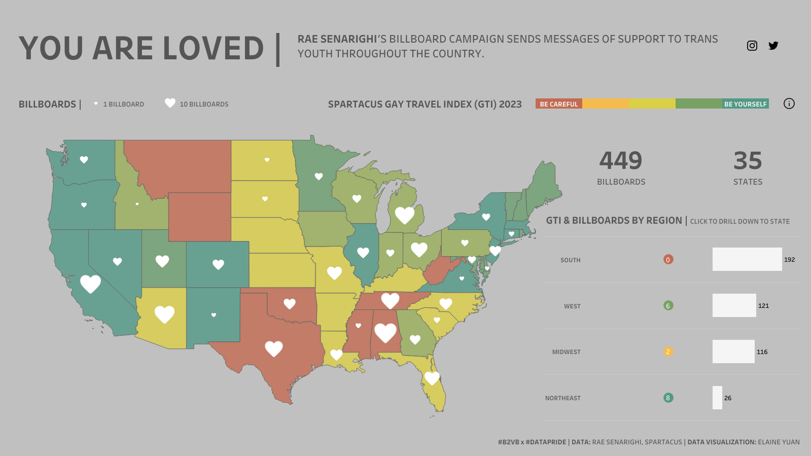
While looking for more data to visualize for Pride Month, I encountered some Tableau community project challenges, including this Back 2 Viz Basics x Data Pride challenge: https://data.world/back2vizbasics/2023week-11-build-a-map
As the challenge asked, I built a map, but I wanted to supplement my visualization with more data. I remembered that the Spartacus Gay Travel Index also had a US-Index. I brought in the Gay Travel Index data and combined my two maps on one axis.
Also, I utilized set actions for the drilldown (from region to state) in the table and parameter actions to “filter” the map by region. Lastly, I played around with the placement of the elements of this visualization and finally settled on floating some containers to the right of the map of the mainland US.
LGBTQ Film Representation 2021

Another community project I found in my search for data was Diversity in Data. I found my next dataset here: https://data.world/diversityindata/diversityindata-may-23-mental-health-awareness-month
As you can see from the dataset, I had four small tables of data to visualize - challenge accepted. I kept most of my visualizations simple with bar graphs and donut charts. However, I added some things I learned from the Flerlage Twins’ How to Do Cool Stuff in Tableau presentation and built my first sunburst chart! ☀️
While I was working in Tableau, I was also reviewing the GLAAD Studio Responsibility Index 2022 for context. This is where I learned about the Vito Russo Test. When I have more time, I’d love to incorporate that data into this visualization (likely through screen scraping), but I am content with the visualization as is.
I’m pleased that this month’s projects introduced me to new Tableau community projects, including Data Pride and Diversity in Data. I hope to continue to participate in their projects and produce more meaningful Tableau visualizations in the future!