The challenge today was fairly simple make a dashboard using the data from the pudding boyband database, the catch was that we had to have it finished and published by 1pm in time to watch DS39's Client Presentation (4 hours if you worked through lunch).
I wrapped up my effort by 12:30, initially I did some prep in Alteryx as there were two tables; one for the bands and their peak hit and one for the members that included some descriptive information.
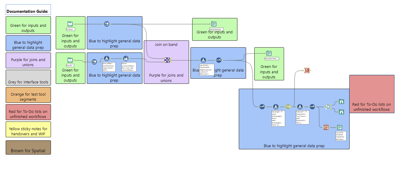
I just made sure that I had the hit information on the rows for the members in case I needed it later, parsed some dates and calculated age at peak hit as a measure to be used in the dashboard. I also initially wanted to look into what correlated with a successful boyband member so started to look into reshaping the data for that but ultimately decided there would not be time to flesh out that idea. I also wanted to bring in some additional data and allocated about 10 minutes to googling potential sources but none of the options felt feasible in the time frame.
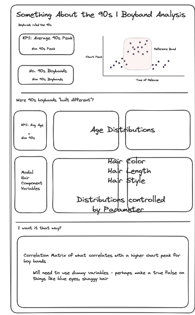
The core of my sketch and plan was to build a story out of the peak in popularity of boybands in the 90s. I wanted to make more of a story dashboard as I have not done so in a long time and it felt like an extra challenge given the time. The subsequent sections planned to explore potential appearance differences and then try and produce the ideal boy band member.
In producing the dashboard I pivoted slighlty, the first two sections remained roughly as envisioned but I scrapped the final section in favor of a brief section looking at the type of music produced.
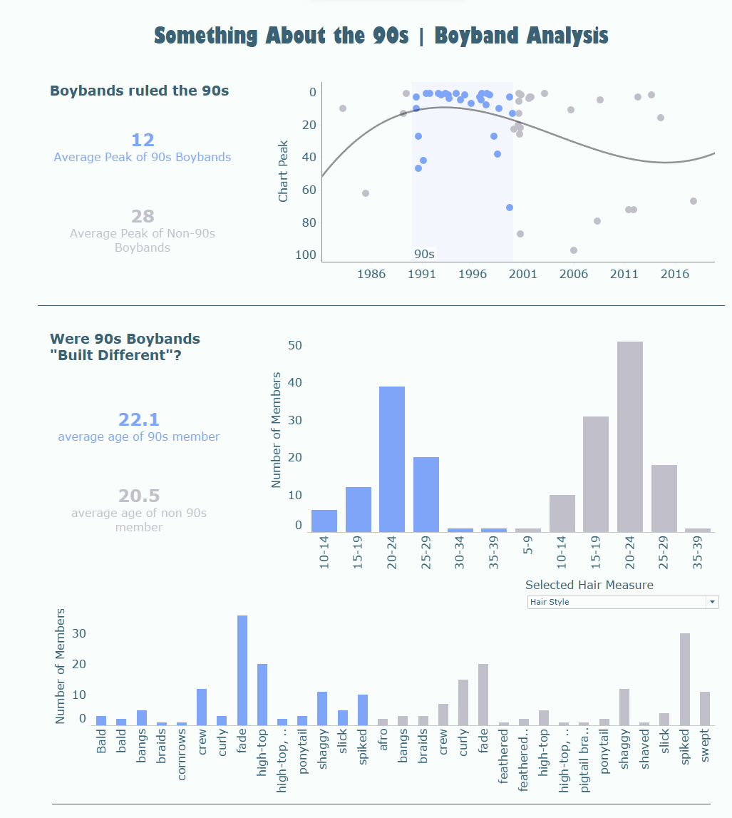
What I think went well is I like the scatterplot to start with showing the pattern that I want to explore/sets the context of the following comparison.
The age histogram does a good job of showing not a tremendous amount of difference between 90s and non 90s, the hair aesthetic section also does not show anything obvious beyond perhaps fades and hightops being more appealing that the spiked, shaggy and swept hair of non 90s members.
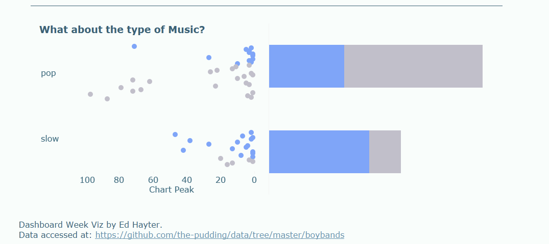
Finally, with music type the dot plot does a good job of showing that non 90s pop is less densly distributed towards the top of the charts and that perhaps if non 90s bands did more slow ballads they might be closer in success to 90s bands.
Overall I am fairly happy with the dashboard. It also filters/highlights to specific bands and I wanted to leverage the links to the music videos but could not get that workign which was a shame. Finishing the blog before presentation time and therefore not needing the 5:30 extension with 15-20 minutes to spare was also good. I think I did a decent job at scoping once again and have produced a dashboard with a couple of notable insights.
One improvement is figuring out a way to tidy up the axis for the hair styles, it is very cluttered and perhaps a top N filter might have been the best bet to improve it - but it would probably have knock on effects for the parameter that toggles the measure.