I enjoyed meeting some potential applicants to the Data School at a recent Meet & Greet event in the office: it's great to see so many people keen to join.
One questions I kept hearing was simply "How do I get started with Tableau?", and I wanted to share a few thoughts on what I learned during my DS30 application.
The application process
Though the team may take a look at your CV and ask you about yourself during the application process, the biggest focus will be on how well you learn to use Tableau. You will be evaluated on the potential you show, rather than on your educational achievements, or past work experience.
The application process is outlined here, but I have included my own quick summary:
1. After downloading a free version of Tableau, and creating a Tableau Public account, you will be expected to create a dashboard (or 'viz') using data of your choosing. This task is very open-ended, and people have chosen all kinds of datasets in the past.
Once you have made something you are happy with, you can submit this using the application forms here; note that we take a new cohort every month or two, with their own application deadlines, and you will need to choose a specific cohort to apply for.
2. If you can get your dashboard submitted before the day of the deadline, a team member will give you some brief feedback on what you have produced, and you will be able to edit your work and re-submit this dashboard.
3. After viewing all the applications, the team will select some people for screening interviews. These will usually be Zoom calls, and will require you to present your dashboard to one of the team members for about 5 minutes. They will ask you a few specific questions about it and give some feedback, and then ask a few standard interview questions to find out a bit more about you.
You might find out if you are being put through to the final stage of the interview process during this Zoom call.
4. If you are invited for a final interview, you will be sent a specific dataset to create another dashboard. This time, however, you will only be given about a week to work on it.
All applicants will receive the same data, so the challenge is to create a dashboard that tells a clear story and provides useful insights, while also creating something that stands out. You might consider adding another relevant dataset into Tableau to enhance your dashboard.
There is an opportunity to share your work for feedback from a current team member, who can give you specific suggestions for improvement.
You will then present your final dashboard to a panel of interviewers, and they will ask you some questions about your work and yourself.
Your first viz
I've put together 6 suggestions for first-time applicants for the Data School below, which I found helpful when building my first dashboard.
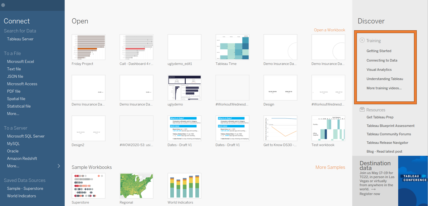
Tip #1: watch videos to cover the basics
I would start by watching some tutorials just to get used to the basic concepts in Tableau. Some official 'How-To' videos can be found in the 'Resources' part of the Tableau Public website, or in the 'Discover' pane when you first open Tableau Desktop:
For a solid overview of what Tableau is and what it can do, I would suggest starting with this video from the wonderful Tableau Tim.
(The Information Lab also has a great YouTube channel with many introductory videos on Tableau!)
Tip #2: learn using Superstore
Tableau Desktop comes with the 'Superstore' dataset already available to connect to, and you will find that many tutorials and articles online will use this dataset as an example. Superstore data is really useful for new users of Tableau when they are first learning to build different kinds of charts.
It is very tempting to start looking for a dataset for your application dashboard right away, and try to build charts using that data; however, your data might be complex and messy, and difficult to learn with efficiently.
Experimenting with Superstore data first will make it much easier for you to understand how Tableau works, because it is optimized for this purpose.
Tip #3: be prepared to compromise
You will be advised to create a dashboard on something that you find interesting, and it is definitely important to look for data that you will be able to present in an engaging way. However, don't get too fixated on finding the perfect data, because the perfect data does not exist! Even if you find data that relates to a topic that interests you, it might not be in a suitable format for Tableau to read in.
Be prepared to try an idea out, realize it might not work, and start your search again. I started out by looking for data on biodiversity in London, and struggled to find a suitable dataset from the past few years; the dataset I ended up using was about calls to the London Fire Brigade.
Tip #4: ask/answer questions using your data
Once you have found a suitable and interesting dataset, it can sometimes be intimidating to start building charts in Tableau.
A suggested starting point is to think about what kind of questions you want to answer using that data. You might just want to write out a list of all possible questions: in my case, for example "When do the London Fire Brigade receive the most calls in the year/week/day?"
If you are building a chart that looks cool, but doesn't really help answer any of your questions, it might not be worth the effort!
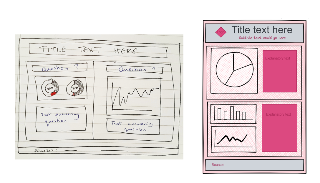
Tip #5: make a sketch
Even if you only do a 30-second drawing, sketching out how you want your dashboard to look is a really helpful part of the design stage. It gives you an idea of what your end goal will be in terms of layout and appearance.
A pen and paper sketch can be good enough, but if you prefer something digital and easy to edit, Excalidraw is another great option:
Tip #6: get feedback
In both the first and second rounds of the application process, you should have the opportunity to share your work with a team member for feedback.
It is important to get your dashboard sent over to that team member ahead of the final deadline, so that they have time to look at it properly and give you a more detailed response.
This feedback is incredibly valuable for letting you know what is and isn't clear in your dashboard. It is also a good way of seeing how well you respond to feedback in general: imagine that team member is a client, and that they are asking you to improve on some work you produced for them.
Finally, here are some handy resources that I used when starting my first application:
About the Data School:
This blog on the application process, and this blog on what it is like to reapply for the Data School, both by previous DSers. There are lots of other blogs on this site too that are well worth a read.
There is also plenty of information on the Data School website about the role itself, and what The Information Lab does.
Inspiration:
As well as just browsing Tableau Public's Discover page, I also looked at several blogs by Andy showcasing successful application dashboards of previous cohorts.
It's important to point out though that Andy's blogs will include some final round dashboards (i.e. where people have received feedback on their first viz, and got a lot more comfortable with the software), as well as the work of people who might have applied for the Data School before.
Don't be too intimidated if your first viz is not as impressive to look at as some of these examples; the most important thing is that it tells a clear story.