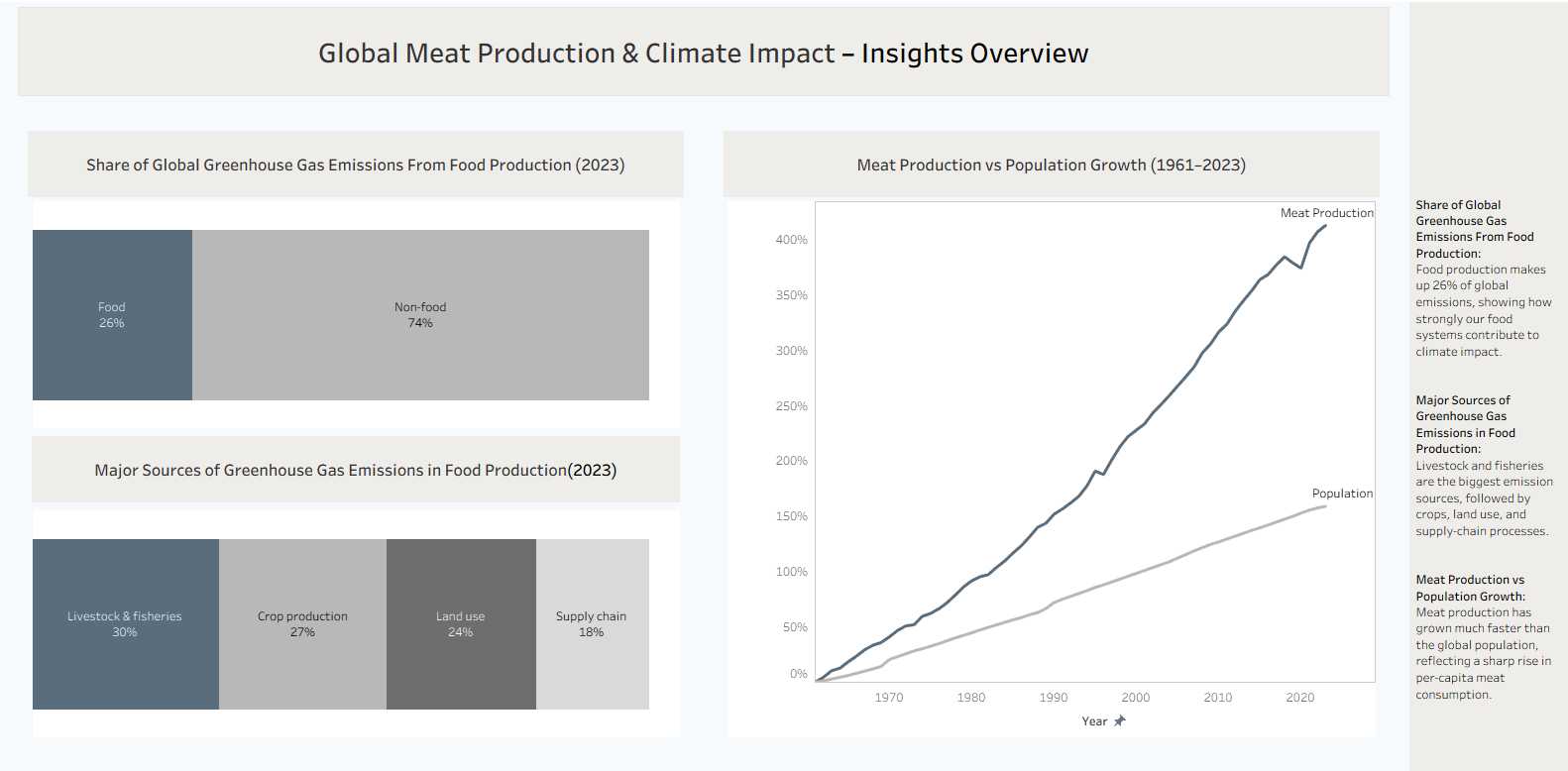
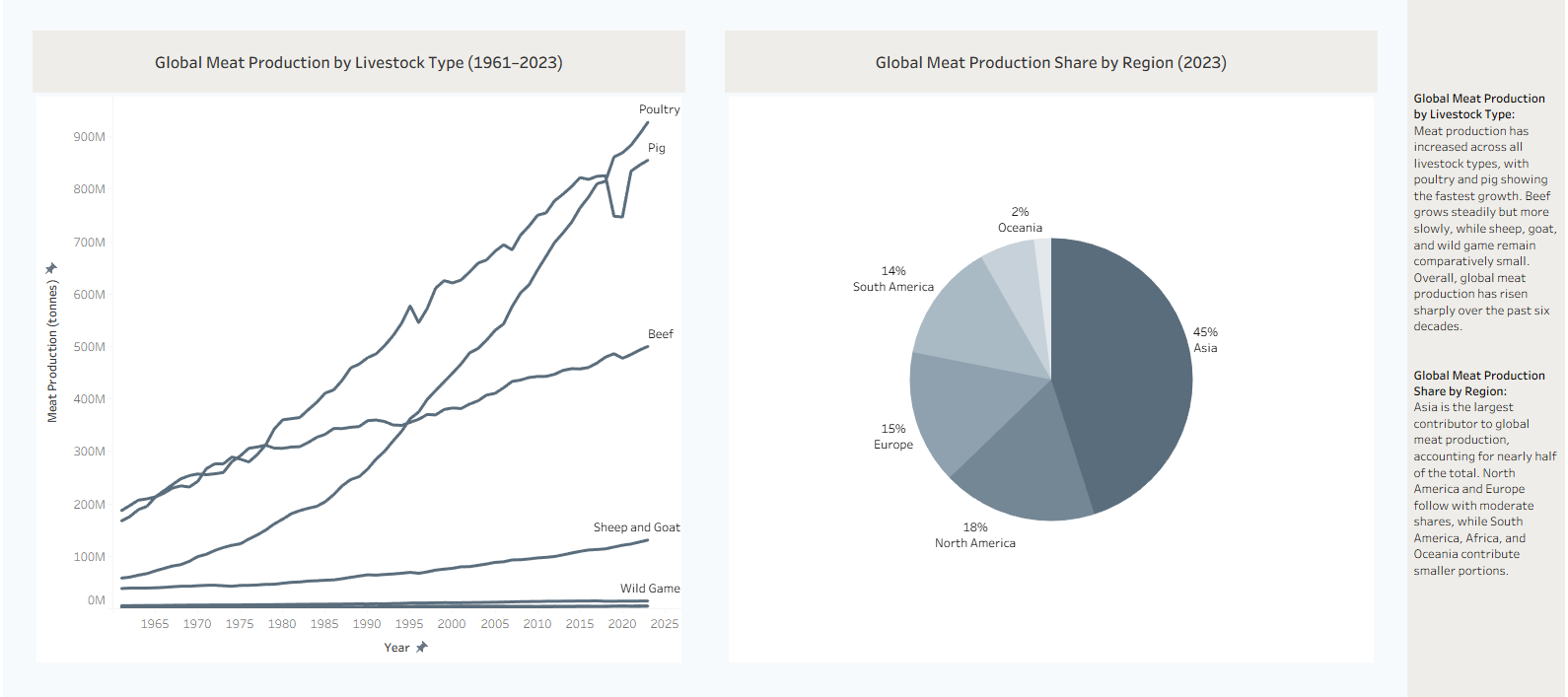
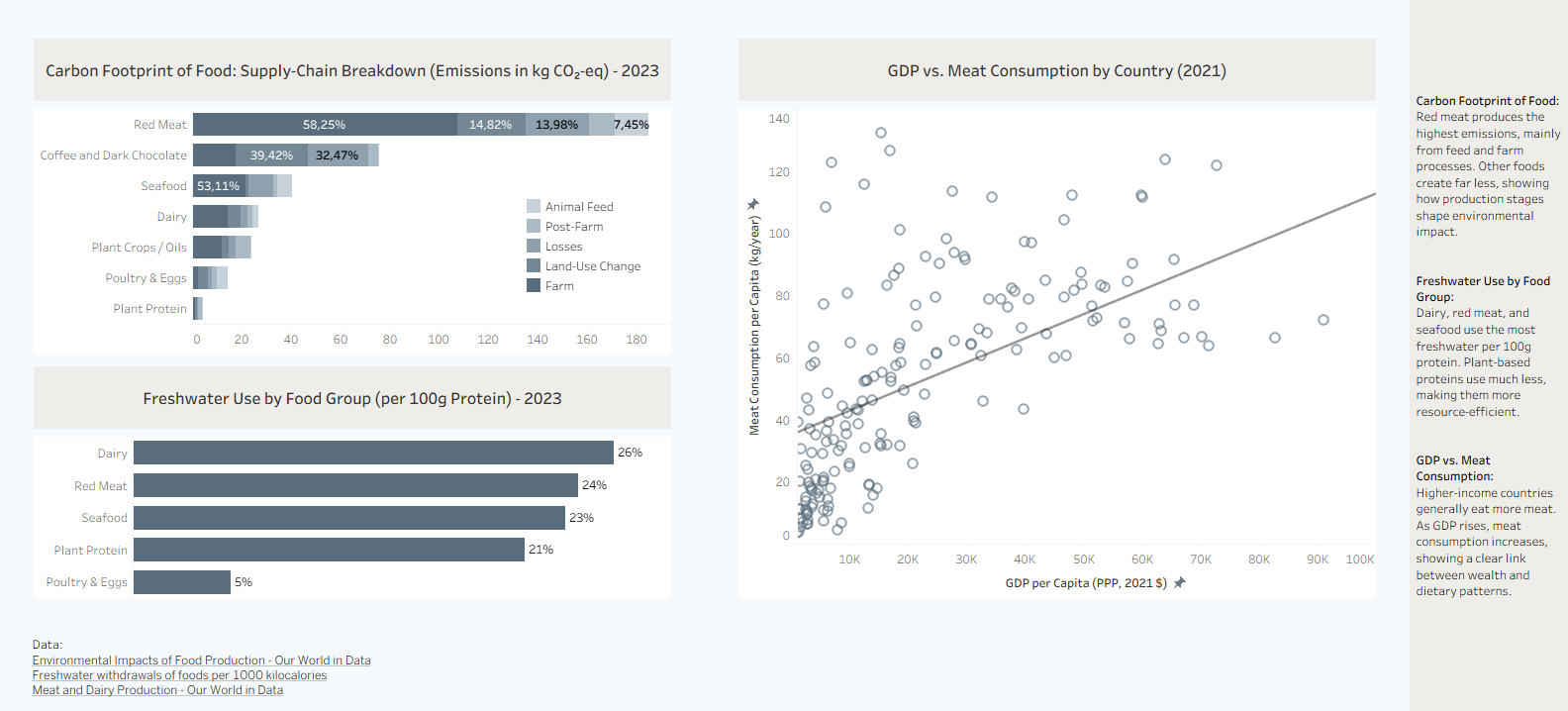
Over the past weeks, I was exploring ideas for my personal project, and yesterday I finally came across a topic that I found it appropriate: global meat production, its environmental impact, and how to visualize these insights clearly. This quickly turned into a meaningful learning project that helped me experiencing both good analysis of this topic and a dashboard design.
Project Context
My aim was to understand how meat production connects to issues such as emissions, water use, and global consumption. Because the topic is complex, my focus was on creating visualizations that make the information easier to understand.
Objectives
My goals were the following:
- Gather reliable global data
- Build a clean and minimal Tableau dashboard
- Show the key trends clearly
- Maintain a consistent visual style throughout
Challenges
Some parts were more difficult than expected. Cleaning/prepairing different datasets and fixing percentage-growth calculations took time. Choosing a minimal but readable color palette was another challenge. Making the dashboard look clean without losing important information also required several iterations.
What Worked Well
The final visual style turned out clean, calm, and easy to read. The charts flowed well together and supported the overall story. Checking calculations early helped avoid larger issues later, and separating the content into clear sections made the dashboard more user-friendly.
Key Learnings
I learned that design often takes the most effort. Color choices play a big role in guiding attention. And most importantly, clear storytelling helps people understand complicated data.
Future Improvements
If I continue this project, I would consider exploring alternative proteins, or creating interactive scenarios. I also need to add some images to make the user curious about the dashboard. It would also be a good idea, to add text in order to help user with the analysis.
Final Thoughts
Overall, this project helped me turn a rather complex topic into something more understandable through clean visuals and structured analysis. It strengthened my skills in data preparation, visualization, and communication, and I’m happy with how the final dashboard came together
Here the link to the dashboard and screenshots are added below:


