I was concerned for today's Dashboard Week challenge because I was absent during our API training. To prepare for today, I watched Robbin Vernooij's video, API's & Data - Alteryx Basics, on The Information Lab's channel last night. (Thank you, Robbin!!)
Furthermore, I relied heavily on Liam Wood's blog post tackling the same Dashboard Week challenge. (Thank you, Liam!!) His approach to pagination was especially useful and I'm so appreciative for the many resources in this company.
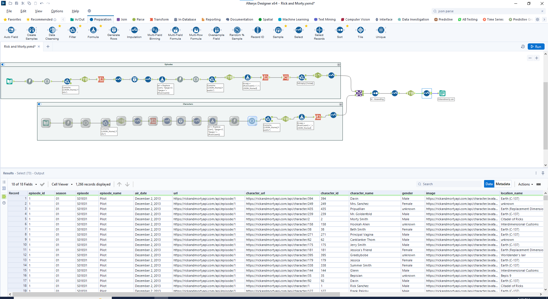
After retrieving Rick and Morty character data and episode data from the API, I joined the two on character ID and brought my data into Tableau. I later added a column for Season to the dataset.
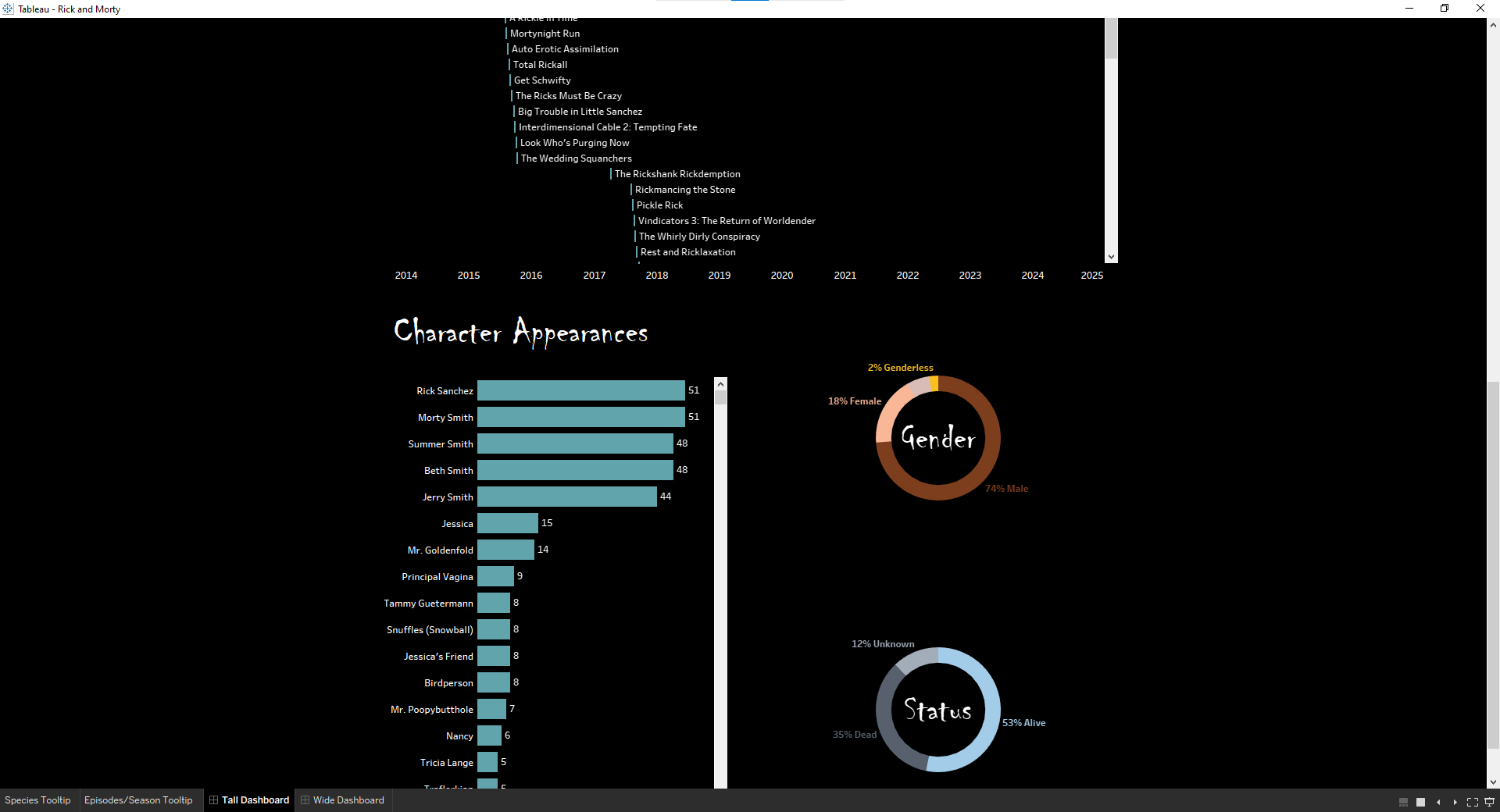
I do not watch Rick and Morty, so I knew my dashboard would likely be summative in nature. When I had enough visualizations for a dashboard, I started building my dashboard tall, like an infographic. However, I realized that with my added dashboard actions, the height of the dashboard would inconvenience the user - users would have to scroll to see the effect of the action.
I then pivoted into designing a wide dashboard and I'm much happier with the result. I like that it fits on one screen!
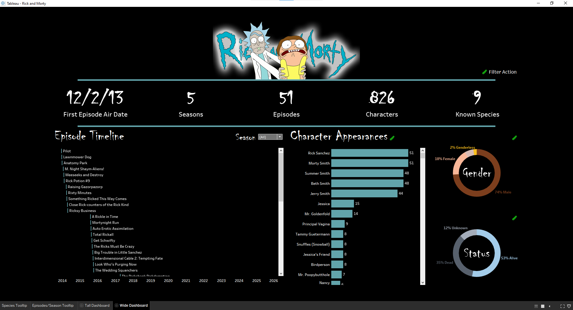
I am content with the dashboard above. My favorite visualization is the Gantt chart for the episode timeline. I also love my color scheme and the presence of pickles. However, I would love to add character images, like my peers have done in their dashboard. Additionally, even though I like the 🥒 Filter Action, I need to find a better placement for it. Any recommendations for that key?