It's the last day of our dashboard week and also the last presentation of DSDE11 in training! I can't believe how quickly time flies 😆.
On this day, I had the opportunity to create a dashboard with my Spotify data. It was so cool to see my streaming habits, when and how often I listen to music and also all information about artists, albums and tracks.
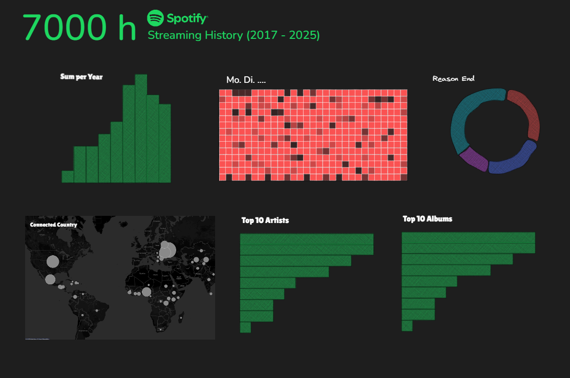
At first, I looked at some existing dashboards on Tableau Public for getting some inspirations. Then I create a rough sketch like this:

I wanted to have a kind of normal dashboard at first but then I changed my mind to build the dashboard in a long format because there is so much I can do with the Spotify data.
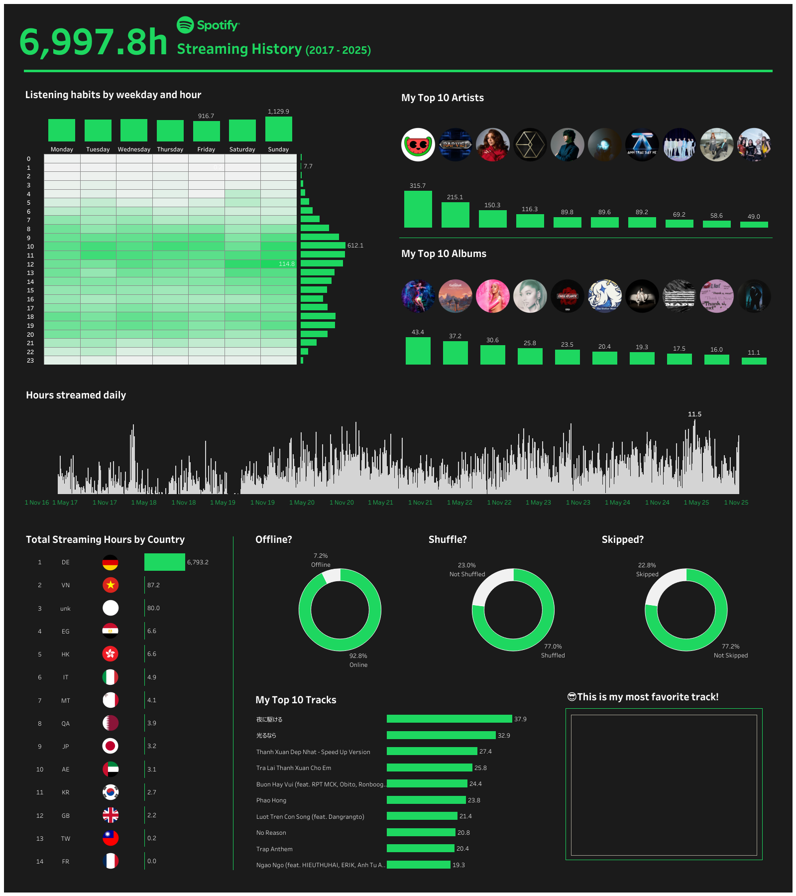
I did keep some of the charts in the original sketch and of course create many others in my NEW dashboard 😄. Sooo this is the final result of the first MVP of my Spotify dashboard:

I had so much fun while building this dashboard, especially putting the images of artists, albums and country flags in a circle shape and then on the dashboard. Aside from that, I was so surprised every time I found an interesting fact about my streaming habits that I didn't expect 😆.
I definitely want to build more interactivities for this dashboard buuuut that's for the near future again!
See you in the next post!
